Beauty and the bridge

I love bridges and cannot imagine Paris without them. In Paris I gaze at them, linger on them, and take photographs. At home I remember them fondly. But of them all is there one that I love the most? Oh yes. And although I am a historian of technology, my favourite is modern, very modern: la passerelle de Solférino (the Solférino pedestrian bridge, recently renamed the Léopold Sédar Senghor bridge), which opened in 1999.

This superb design by engineer-architect Marc Mimram (born in Paris in 1955) links the Jardin des Tuileries to the Musée d’Orsay. It is fitting that the bridge upon which pedestrians walk to and from a former tileworks (now a garden) and a former train station (now a museum) should itself be a superb work of industrial and engineering art. For this bridge Marc Mimram was awarded the coveted architectural award, Equerre d’Argent.

Mimram’s is the third bridge at the site. The first opened in 1861 to celebrate Napoleon III’s 1858 victory over the Austrians at the Battle of Solférino. It was a handsome three-arch cast-iron bridge, which carried vehicles and survived the ravages of the great flood of 1910.

But in a busy commercial river at a relatively narrow spot, the abutments for the bridge sometimes got in the way of heavily laden barges (péniches). After decades of collisions, the bridge had become dangerously weakened (fragilisé).

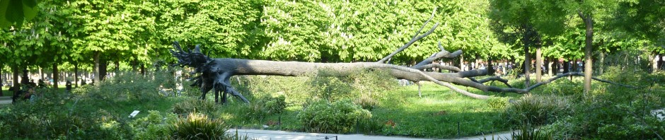
The photo below, taken on April 26, 1961, shows the about-to-be-demolished original bridge with the “temporary” replacement dominating the foreground.

“Temporary” is a relative term, not an absolute one. For three decades, this undistinguished structure allowed pedestrians to cross the Seine at one of its most beautiful points. It was finally demolished in 1992. What did the 30-year-old “temporary” bridge say about Paris?

We all read designs and our environments differently. I find the temporary bridge more than merely ugly and unimaginative. It reminds me of the countless pedestrian overpasses I have driven under on expressways that cut through neighbourhoods where the locals don’t count politically. Or where politicians and engineers have insisted that ugly = efficiency + value for money. In some places, people really believe that ugly means their tax dollars are being well spent.

Whatever the reason for its uninspired design, whatever the reason for its longevity, the second bridge seems alien in design-rich Paris. It looks neither Parisienne nor respectful of those who must look at it and cross it. To be fair, the bridge did do what it was designed to do: it allowed people to walk from one side of the Seine to the other. However, if you look carefully, you will notice that both the bridge of 1861 and that of 1961 only joined the tops of the embankments. To get to river level, one took the stairs.

Mimran’s passerelle de Solférino changed many things. It crossed the Seine in one leap, so there are no abutments to bump into at river level. And it joins four points, not just two: water level on both sides of the river and the top of the embankment on both sides of the river. And it makes the journey visually interesting.

Here we are beginning to walk from water level to the top level as one prepares to cross the Seine.

As one approaches the bridge, one is struck by the richness of detail. I saw other users of the bridge lingering to examine the details, just as I have on other bridges that have been designed to let us appreciate being alive rather than just letting us get on with the next job.

The details, precision, and lightness of material reminds me of aircraft engineering. As I walked across, I thought about airplane structures and the innards of a jet turbine engine I had recently seen and admired.

But as our pedestrian crosses (alas, the famous yellow raincoat is no more: it was later stolen – in Toronto), what awaits her?

Having arrived at river level, she might take the stairs in front of her to cross under the traffic and emerge in the Tuileries gardens. Or she might choose to stroll along the bank.

Or our pedestrian could have done what this bridge was really designed to do. And to appreciate this fully, follow this link (view it full screen). It’s not just a bridge to look at, but a bridge to look from.

I regard this bridge as a reaffirmation of the long tradition of aesthetic excellence and sensitivity amongst French bridge engineers (the bridge designs of Gustave Eiffel are a good example). This tradition is deeply rooted in their best educational institutions and widely visible. Such sensibilities are absent in many countries.

But designs such as the passerelle Solférino could not have been done without computer-assisted design methods, linking the best of tradition with the best of technology. Furthermore, as if in rebuke to those who associate ugliness with efficiency, the bridge makes very economical use of materials (steel and wood).

Marc Mimram has a clearly expressed philosophy of design and aesthetic sensibility, along with the talent and good fortune to put it to use. For a quick introduction go to his website and click “Agency.”

The page is worth reading and rereading carefully. Note that he is described as both architect and engineer: this combination is exceedingly rare.

One reads that “We have always considered that architecture cannot remove itself from the field of construction and that the execution is equally a determinant for a project as it its conception.” In other words, don’t design it if you don’t know whether it can be built. (You’d be surprised how often this happens with professionals.)

More important, he is not talking about structures in isolation, or on a computer screen, but structures as part of our lives and the space we occupy. “A bridge is not just a connection, a road, not just an asphalt strip accommodating migratory traffic.” He adds that when one thinks of and works within “local scale” and “an informed historical geography,” then “the bridge becomes a balcony for a stroll on the river, the road a passage through the features of geography.”

Well isn’t that curious? Most of the bridges I experience as a pedestrian make me feel I am simply a legally required nuisance, and the roads on which I drive seem designed to feel and be the same, no matter what the local geography.

Mimram speaks of the sin of designing in which saving time takes precedence over all else. “To avoid the errors of yesterday, it is necessary that these major transformations not be reduced to their technical values; we have to find the qualities that are sensible to the consideration of the project’s landscape, the constructed qualities of structural works, and the qualities sharing the public forum.”

He warns that we lose much if we think of the city solely in terms of “mathematical imagery” and adds that “conversely, it is the attention to places, the value of light, and the pleasures of gravity and material that are put in place that assure the generosity of shared space.”

Ah, the “generosity of shared space.” That, I think, more than anything else, is what I find so intriguing and beguiling about Paris. There is privacy, but there is much shared space. And when I stand on the passerelle Solférino I am sharing space, views, and perhaps even conversations. This is not just city life, this is life.

Text and original photographs by Norman Ball

Further reading: Marc Mimram — Minimal Design: Solferino Bridge in Paris, by Francoise Fromonot

Click here to watch an interview with Marc Mimram (with English subtitles). In it, he discusses the use of new materials, such as a new form of concrete called Ductal.

Posted in Paris bridges | Tagged , , , , , , , , , | 8 Comments

Unreliable memories

Memory is a slippery thing. It depends a lot upon what you notice at the time. (Norman: I wonder who owns that yellow Lamborghini parked down the street. Me: There’s a Lamborghini parked on our street?) It also depends upon your interests and pre-existing knowledge. (Me: Don’t you think that Geoffrey Rush was wonderful in The King’s Speech? Norman: Was he the one who played the part of the king?)

The French have a special relationship with memory, and it figures importantly in their literature. There’s Proust, of course, but I think he got one important thing wrong. In that long passage about dipping his madeleine into a cup of tisane and recalling his childhood, he ends with the sonorous words, “l’édifice immense de la souvenir” (the immense edifice of memory). I beg to differ. Memory is not a large, stable, building-like structure. It’s more like…macramé. It’s hard to know where any particular strand will lead, and it’s full of holes.

I think about this whenever I re-read a book that I enjoyed a decade or more ago. Especially one as unusual as The Lady in the Car with Glasses and a Gun, by Sébastien Japrisot (La dame dans l’auto avec des lunettes et un fusil), published in French in 1966 and in English translation in 1967. I must have read it some time during the 1980s. I thought I remembered what happened, but it took me by surprise all over again.

Appropriately, the book itself is about the slipperiness of memory, and the way in which one’s perspective influences one’s impressions, and ultimately, one’s memories. It starts off with the first-person story of the lady in question, shifts to the point of view of minor characters (a gas station owner, a policeman, a hitchhiker), then back to the woman, ending with the first-person story of another character altogether.

The Figaro Littéraire once said that Sebastien Japrisot wrote “like Simenon proof read by Robbe-Grillet,” but I think it was the other way around. Alain Robbe-Grillet was one of those postwar writers and film-makers who helped create what was known as Le Nouveau Roman (the New Novel), with books (and films) in which nothing is quite as it seems, and multiple perspectives make one unsure what is really going on. There is no omniscient narrator, only the views of various participants, and no clear “truth” or “reality.” In his famous film L’Année Dernière à Marienbad (Last Year in Marienbad), the characters have no proper names, one scene contradicts another, and people move through an enigmatic dreamscape in which people have shadows and objects do not.

Japrisot’s book is like that. It’s not so much a whodunnit (although there is a dead body to be accounted for), as a whatonearthjusthappenedhere.

I won’t spoil the story, but here is the situation. The lady in the car is Dany Longo, who works as a secretary in an advertising firm in Paris. Just before the Bastille Day long weekend, her boss asks her to take on some extra work, by going to his house to type up a long document he needs immediately. She works Friday night and Saturday morning, staying overnight in the house. Then he asks her to drive him and his wife to Orly airport and return the car (a white Thunderbird convertible) to his home.

Dany, with her huge prescription sunglasses, is a timid person, who has never ventured very far from her usual routines, but as she leaves the airport behind the wheel of the Thunderbird, she decides to strike out for the south because she has never seen the Mediterranean. She figures the boss will never know if she gets the car back by the end of the weekend.

That’s when things get strange. As she travels through small towns she has never seen before, people seem to recognize her and the car, and mention incidents that involved her. They insist that she left her coat in a certain restaurant, had her car serviced in a gas station, was stopped by a police officer who noticed her tail-light was broken. As the evidence mounts up, the reader starts to wonder who Dany really is and if her account of events can be trusted. This is all very Robbe-Grillet: in L’Année Dernière à Marienbad, a man keeps insisting to a woman that they had met the previous year, while she denies ever having seen him before. Who is speaking the “truth”?

Japrisot’s book was made into an English-language film with English stars (Samantha Eggar as Dany, Oliver Reed as her boss, John McEnery as the hitchhiker) by the versatile director Anatole Litvak in 1970. It was the last film he ever made (he died in 1974). Interestingly, he also directed All This and Heaven Too, which I wrote about in a previous post.

I haven’t seen the film. I’m not sure I want to. I don’t think it would convey the same disorienting sense of multiple perspectives, from the interior dialogue of the neurotic, yet surprisingly resourceful Dany, to the people who see her only as a remote beauty, aloof and enigmatic behind those huge glasses.

The film even had a peppy little song performed by Petula Clark (!) about hitting the open road and leaving one’s troubles behind. Clearly the lyricist was not paying attention, since Dany’s troubles begin when she hits the road. You can hear the song on YouTube.

Sébastien Japrisot, 1931-2003, wrote several other crime thrillers, as well as the historical novel A Very Long Engagement, made into a movie in 2004 starring Audrey Tautou (I did see that one, and I think the book was much better). It, too, involves varying and conflicting accounts about a particular event that can be interpreted in several ways. Japrisot’s pen-name was an anagram of his real name, Jean-Baptiste Rossi. He knew the advertising world well, having worked in publicity. He wrote eight novels, three of them crime novels, as well as a dozen screenplays, and translated J.D. Salinger and various westerns about Hopalong Cassidy into French.

I have three more of his novels, which I intend to reread over the next while: 10:30 from Marseille (Compartiment Tueurs, 1962), Trap for Cinderella (Piège pour Cendrillon, 1963), and One Deadly Summer (L’Eté Meurtrier, 1978). I may not read them all at once, however. Doing so might destroy my faith in memory forever.

Text by Philippa Campsie

Posted in Paris film | Tagged , , , , , , , , , , | 2 Comments

Tall tales and some Paris-Marseille rivalry

Tall tales abound in every culture. When Philippa and I set out to explore our new neighbourhood in May, we never suspected that we would learn more about tall tales in France.

On the nearby Rond-Point des Champs Elysées, a small sign announced a familiar name: Artcurial. We crossed the forecourt and entered. What appeared to be crowded bookshelves at the end of the hall turned out to be a wallpaper that only looked like that, and directed us to one of the finest bookstores we have seen in Paris.

It was expertly stocked and exquisitely laid out with the sophistication we associate with the name Artcurial. Amidst the wealth of books on the history of painting, sculpture, photography, fashion, architecture, and industrial design, there was a single copy of a bilingual book with a rather lurid cover: Photomontages Improbables (Improbable Photomontages) by Alain Weill.

I knew about the work of 19th-century photographers such as William Notman, who merged many single photos into massive groups shots. And we had seen an exhibit at the Art Gallery of Ontario that featured the work of aristocratic women of 1860s and 1870s, who cut photo portraits from the ubiquitous cartes-de-visite of the day and embellished them with their own paintings. Posing as amusing works of art, these photocollages often provided incisive, even cutting, social and political commentary.

The images on the postcards in Photomontages Improbables were quite different. Their impact depended on having at least one element per image that was wildly out of scale. The oversized images recalled the tall tales genre in which the familiar – or the somewhat plausible – is exaggerated, often to show the superiority or distinctiveness of a region, individual, group, or activity.

Weill’s book is primarily about the work of two American photographer/publishers (William H. Martin and Alfred Stanley Johnson) who, starting in 1908, used photomontages to create absurd, fantastic, and exaggerated postcard images and messages. They created images such as an ear of corn so big that it had to be hauled on a wagon by a team of horses, or cut with a lumberjack’s saw, tomatoes so large a wheelbarrow could hold only one, two onions that took up an entire railway flatbed car. This genre lasted many decades, but holds little interest for me.

However, I spotted an altered image of an unusual French bridge, of a type that I had written about it in a previous blog. This bridge was in Marseille, and the photo had a curious addition. Slung beneath the bridge, covering the entire width of the waterway, was a fish, to be precise a Very Large Sardine.

This was the only French photograph in the book. The author implied that this was a specifically American genre and that there were very few French postcards of this type. I didn’t believe him. I was sure there were more French fantastic or tall-tale postcards. So began a new quest.

With my electronic dictionary on standby, I asked a few postcard dealers at the stamp and card market off the Champs Elysées about les cartes postales fantastiques (fantastic postcards) with images such as ponts et poissons (bridges and fish). They assured me such things were quite common. One dealer said he would bring some for me if I came back on Thursday.

I duly returned on Thursday. The dealer had brought quite a few, including the one above.* Except for the publisher, it was identical to the one shown by Weill in Photomontages Improbables. The dealer proudly proclaimed he himself was from the Marseille region and that people there liked to exaggerate as a way of showing their pride and letting the world know that theirs was a region worth visiting.

The bridge is the famous transporteur built to carry a section of movable roadway slung beneath it, complete with passengers and vehicles. The verse is a hymn of praise to the bridge and a reminder of how big the sardines are in Marseilles, a famous fishing port.

Greetings! Superb machine with sturdy spine
Through you, Marseille has, at the cost of a long effort, been able
To remove from the blue waves the famous SARDINE
Which for 50 years blocked the entrance to the Port.

Another card, which represents the sequel to the story, bears the title, Char Funèbre de la Célébre [sic] Sardine Marseillaise (Funeral wagon of the celebrated Sardine of Marseille).

The verse reads:

On this funeral wagon lies the celebrated SARDINE
Who for 60 years blocked the entrance to the Port
With his dry and tranquil eye
He scorns Parisien and Gascon [the people of the Marseille region].

Marseille might not have the Eiffel Tower, but it has its Enormous Sardine.

Although well inland, Paris sees itself as an important port. The city coat of arms bears a ship and Paris is in a region called l’Ile de France (the Island of France), although it is not an island at all. The postcard below is meant to remind Parisiens that real ports have more than just water and boats; real ports have plentiful fish.

The card titled “Oh? Ces Marseillais” might be translated as “Oh, these people from Marseille.” That part was easy. The translation of part of the wording under Le Parisien took us some time to figure out. The problem word was “un sceau,” which translates as the stamp or seal one would put on a document. But recently, when Philippa was stumped by a translation, she asked Lucie, a French friend in Paris, who promptly replied that the troublesome word was simply a typo. Thinking along those lines, Philippa realized out that what appeared as “un sceau” should have been “un seau,” a bucket. Now we can translate.

Le Parisien says, “When we in Paris want some fish, we hurl a bucket into the Seine and we have some.”

But in Marseille? “Those of us from Marseille, when we want a bit of water from the sea, we have to beat the fish away with our hands.”

The lesson: if you want some place where the waters are teeming with fish, then go to Marseille. The Paris/Marseille rivalry is also evident in the figures of the two men. The robust fisherman in the striped jersey is clearly the clever Marseillais, whereas the confused and frightened-looking dandy who has lost his newspaper and soon might be hatless is the effete Parisien. Note also the determined fish – clearly a Marseillais – who has grasped the bow-rope and the stunned Parisien dog.

The card was sent from Marseille and the written message (in French) on the back begins, “In order to give you an idea of the jokes made about those from Marseilles, I am sending you a sample of their tall tales (galéjades).”

Clearly only the first card — the bridge and the sardine — is a photomontage, while the others might be more properly labelled simply fantastical drawings or collages. However, they all fit into the tall tale genre made from composite images.

Other postcard images draw upon photos that are shot separately and then superimposed to create the final image. This image made of various components would then be photographed to create the final image.

The picture of the abduction of the Arc de Triomphe uses photos, along with some touching up to insert things such as the cables from the Zeppelin and probably the airplane in the upper left. (Note that the Arc appears to have already been dragged the length of the Champs-Elysées, since it appears near the Chevaux de Marly, the statues of horses that stand near the Place de la Concorde.) Rather than a tall tale card, this might be seen as expressing fear for the future or perhaps a certain grim humour and defiance. The Zeppelin is, after all, German and although we do not know when the card was conceived or printed, it was mailed 21 October 1915.**

As so often happens, what starts as a chance encounter piques my curiosity, reminds me of what I know, points out what I do not know, and inspires me to learn a bit more. With French collage and photomontage, I know so little and have so much to learn. What started with an unplanned visit to Artcurial led me to postcards depicting tall tales representing at first amusing rivalries between cities and later deadly struggles between countries.

Text and photograph by Norman Ball

*Mine, regrettably undated, is identical to that in Photomontages Improbables with one exception. Mine has no published or named photographer, only the words Modele Deposé (registered trademark). Weill’s includes “Photo. Bourse. Edit. 22, rue Pavillon” (The rue Pavillon is in Marseille.)

**Another card posted online shows even greater havoc wreaked upon French monuments by modern aviation – Zeppelins and airplanes – and German aggression. This also was mailed in 1915. France and Germany were at war and Guillaume would have been Kaiser Wilhelm, Kaiser Bill to the Brits.

Posted in Paris history, Paris popular culture, Paris postcards | Tagged , , , , , , , , , , , , , , | 1 Comment

The collectors

Before our last trip to Paris, a friend and fellow Francophile lent me a book to read on the plane: The Hare with the Amber Eyes by Edmund de Waal. I highly recommend this absorbing family saga, imaginatively told through the story of the acquisition, travels, loss, and rediscovery of a collection of Japanese netsuke (small carvings) first acquired by Charles Ephrussi, a Parisian art collector, in the 1870s.*

I had never heard of the Ephrussi family, although they were on a par with the Rothschilds in their day. The Ephrussis were wealthy Jewish bankers from Odessa, where they had originally made a fortune in the grain business. Charles Ephrussi, who dominates the first part of de Waal’s book, was an aesthete and patron of the arts who serves as the model for the character of Charles Swann in A la Recherche du Temps Perdu by Proust.

The book included a grainy photo of Charles’s Paris house. The author mentioned that it was not far from the house of the Camondo family (now the Musée Nissim de Camondo) on the rue de Monceau. So of course I had to go and look. I found the house at number 81 and stood in front to take a picture. Edmund de Waal notes that Charles’s rooms were on the second floor (what to North Americans would be the third floor), facing the street.

The house had been finished in 1871, just in time for the end of the end of the Second Empire and the upheavals of the Commune, in an area that de Waal calls “so of-the-minute that [it was an] unfinished, untidy, loud and dusty building [site].” It was the 1870s equivalent of today’s suburban subdivisions filled with oversized houses that have replaced farmers’ fields on the outskirts of many North American cities – enclaves of millionaires, many of them newcomers to Canada or the United States, as the Ephrussis were newcomers to France.

The Plaine Monceau, developed by the Pereire brothers around the Parc Monceau, was something like that, with one important difference – today’s suburban monster houses are surrounded by acres of lawn and highly visible. A good part of this Paris house was out of sight. So I walked into the courtyard (the building is now an insurance office). The house extended along the left hand side. Large windows looked into a courtyard with stable doors opening into it. Edmund de Waal says that the courtyard was once glassed over.

On Google satellite view, I saw that the street side of No. 81 is the narrow end of a large mansion with two short wings; the other end appears to overlook a garden with mature trees. Although tourists walking through expensive residential districts in Paris may wonder how people can stand to live in an environment that seems to be mostly stone, brick and concrete, in fact, nothing could be farther from the truth. Google satellite views show all kinds of gardens and greenery in the interiors of city blocks, overlooked by the windows of large houses, but invisible to mere tourists.

Eventually I wandered back in the direction of the Musée Nissim de Camondo, another huge hidden house. In this case, the façade is directly in front of you as you walk into the courtyard. There were few other visitors and the place was quiet. I paid for admission and received one of those audio guide contraptions.

It’s an odd place, not at all typical of the houses of the period, and nothing like the original version of the Hotel Ephrussi up the hill. The house bought by Moïse de Camondo in the 1870s was rebuilt in 1911 to house his collection of 18th paintings, furniture, and décor. It was intended to resemble Marie Antoinette’s Petite Trianon, so it has little in common with the ornate 19th-century houses around it. The house also has its own garden, as well as a private entrance to the Parc Monceau.

Inside, entire rooms were designed to accommodate expanses of wood panelling or collections of artwork Camondo had acquired. But he was not such an obsessive antiquarian that he insisted the whole house be authentic to the 18th century, so there is a lift, a kitchen with all the modern conveniences of the time, and two glorious tiled bathrooms with what would have been the latest in modern plumbing in 1911.

It is saddening to think that only a few years later, the son on whom Moïse doted was killed in action in the First World War (he is the Nissim de Camondo for whom the museum is named and he was a pilot) and that his daughter Béatrice and her family died in the Holocaust. And it is amazing to realize that because Moïse de Camondo donated the house, with all its furnishings, to the Musée des arts décoratifs in the 1930s, it remained intact, down to the family photographs on the tables, throughout two world wars and the rest of the turbulent 20th century, when so many other collections were dispersed.

From the stairway window, I saw a small cobbled lane to one side, clearly a service entrance allowing for deliveries to the kitchen. Later I found the lane behind the house and walked along it, stopping to watch someone photograph what looked like an aging actor (should I have recognized him?) for what might have been a magazine or commercial shoot.

On the other side of the museum, I also noticed a grand house next door at No. 61. When I left the museum, I saw that this was now the Paris office of Morgan Stanley. But it was not until later that I found out that it had originally been the home of another member of the Camondo family – Abraham, and his son, Isaac. When that branch of the family went bankrupt in the 1890s, the house was sold to Gaston Menier of the family of chocolate makers.** (Much later, in the Second World War, No. 61 went through an evil period as the Paris headquarters of the feared Milice – a French militia that fought on the side of the Germans and against the Resistance.)

Abraham de Camondo was also an art collector, but unlike Moïse and more like Charles Ephrussi, he patronized artists who were his contemporaries – including many Impressionists. When he died, his son wanted to give his collection of pictures to the Louvre, but the Louvre seems to have fumbled the acquisition. The collection was split up – some pieces stayed in the Louvre, some went to the Musée Guimet, and some ended up in what is now the Musée d’Orsay. Furthermore, the name of the donor was at some point eliminated from the public information about the artworks (I am not sure why), so visitors to these museums do not know the source of many well-known Impressionist pictures. The Camondos’ legacy to the city is much larger than most people realize.

This is one of the paradoxes of Paris. The staggering wealth, both past and present, that is so much in evidence is sometimes hard to accept in comparison with the staggering poverty, both past and present, of many inhabitants. And yet the collections amassed, first by aristocrats, later by bankers and other wealthy business people, are the foundation of the city’s reputation as a capital of the arts and are now part of a public heritage. The Camondos and Ephrussis enriched the city, even as they enriched themselves. Without them, the city would be a poorer place for everyone.

Text and photographs by Philippa Campsie

*Click here to read an excerpt from the book.

**Another member of the Menier family, Emile-Justin, had an even more over-the-top house around the corner at 5, avenue Van Dyck.

Posted in Paris gardens, Paris history, Paris museums | Tagged , , , , , , , , , , , | 10 Comments

French advertising postcards (I’ll drink to that)

With our flat only steps away from the Garden of the Champs Elysées near Avenue Gabriel, it was inevitable that we would meet. How could I resist colour so wonderfully lurid in a science-fiction/absinthe sort of way? My eyes didn’t know which curve to follow in this 1930s futuristic vision of a streamlined locomotive.

The front of the card reads:

24 views of the future
Number 12. The express train of the 21st century, a completely streamlined locomotive.
(What were the other 23 visions of the future? Can anyone help me here?)

One the back of the card, one word jumped out from the others.

Byrrh was new to us. Finding out about it was the start of a voyage of discovery. At the postcard market, I had stumbled upon a French classic, a card designed to advertise a wine-based aperitif trademarked in 1873. Founded by the brothers Pallade and Simon Violet, the company is still producing Byrrh in Thuir near Perpignan in the Pyrenées-Orientales.

The late 1890s were the heyday of alcohol-based health products, patent medicines, restoratives, and tonics of all sorts. Byrrh started as a health drink sold at pharmacies, but came into its own as a red-wine-and-quinine-based aperitif. The name Byrrh is now associated with an astounding legacy of compelling advertising art.

Byrrh was so successful that when the company needed its own railway depot, Messrs. Violet Frères called on none other than Gustave Eiffel’s engineering firm for the design. The stunning depot still stands, but is no longer used for trains. Nonetheless the company, now part of Pernod Ricard S.A., thrives and hosts approximately 60,000 visitors per year. One day, Philippa and I will be part of that number.

But taste is what counts. After finding the postcard and reading about a “ghost sign” for Byrrh on one of our favourite Paris blogs, Invisible Paris, we decided we needed to carry out our own taste test. We tracked down a bottle (a dusty one, which had clearly been on the shelf for some time) in the Monoprix on the Champs Elysées.

We came home and poured it out into small glasses. After some experimentation, we discovered that we preferred it chilled with ice and a slice of lemon. It also seemed to taste best when consumed sitting in the open air on the balcony. In the name of scientific gustatory accuracy, we can report that subsequent tests (with minor variations) yielded identical results.

Alas, we cannot buy Byrrh in Ontario from our government-run monopoly (the Liquor Control Board of Ontario). So we now have one more reason to go back to Paris.

But I should return to the postcard. There is more to it than the drink it advertises.

The arresting image on the front was in the spirit of the streamlined locomotives designed by Henry Dreyfuss and French-born American industrial designer Raymond Loewy. Curiously, the unstreamlined dual headlights, which seem distinctly automotive, reminded me of the bug-eyed Austin Healey Sprites of the late 1950s.

In its own way, the back of the card is as interesting as the front.

In the 1930s and 1940s, aerodynamic design was all the rage. Byrrh built on this interest with a fine piece of non-technical writing on the importance of aerodynamics and streamlining. The text points out (and I translate) that “at a speed of 80 to 90 kilometres per hour [48 to 54 mph],” two-thirds of the fuel burned in the engine of a modern vehicle is used to “fight air resistance and the last third of fuel is all that is needed to keep it rolling.” It adds that aerodynamic applications include not just planes and cars, but also transatlantic ships such as the Normandie and locomotives such as the French state railway system’s Pacific locomotive. After the Pacific had been given what then passed for a streamlined cladding, it “used 100 horsepower less at 120 kilometres per hour.”

The card explains that reducing air resistance “translates into an important savings in the cost of coal, which is going to inspire a transformation in the exterior of locomotives so that in the near future, they will have a new look such as that our image has tried to show.” This radical transformation of high-speed locomotives certainly came to pass.

The Pacific locomotive, known as Pacific 231,* although it looked nothing like the vision on the card, was apparently legendary in its day. Indeed, in 1923 a young French-born composer of Swiss parentage gave the locomotive a rare honour: a permanent home in musical history. Arthur Honegger (1892-1955) loved locomotives with a passion. “For me, they are living creatures and I love them as others love women or horses.” He expressed his love in his Symphonic Movement No. 1, more commonly known as “Pacific 231.” It was meant to evoke the feelings, sound and movement of steam locomotives.

You can hear the music and see the locomotive in an award-winning film on YouTube. In 1949 French filmmaker Jean Mitry won the Prix du Festival at Cannes for his Pacific 231, a short cinematographic essay (rather than a documentary) in which Honneger’s music accompanies evocative shots of a Pacific 231 journey. Take a look; it is almost hypnotic.

As for the ocean liner mentioned on the card, I had heard of the SS Normandie, which set out on its maiden voyage on 29 May 1935. However, I had always regarded it as an example of luxury travel and was surprised to learn it was a leader in energy efficiency. The novel hull designed by Vladimir Yourkevitch needed far less power—and fuel—than other massive liners travelling at the same speed.

To get back to the card behind these wanderings, the ultimate message is that even though “everything changes, everything progresses,” if we already have perfection, we need not change. The manufacturers hasten to assure us that “BYRRH alone cannot get better, for this tonic wine with quinquina is perfect.”

It is a brilliant piece of advertising image and copy. It starts with a strong contemporary interest—streamlining—gives the reader good information, and follows through with the message: Byrrh is beyond the need for change.

And so I sit at my desk in Toronto and reflect on a postcard from an outdoor market, a 19th-century drink, and a 20th-century ship and locomotive. How curious. But perhaps I should also reflect on Paris itself, where these things seem to happen to me. I tend to notice details, which become richer upon reflection, making one reflect on what one already knows and inspiring one to learn more.

My French is still abysmal, I seem to be lost half the time, I misunderstand much of what I am told or hear, and yet I love it. For me, Paris offers a confusing richness that is half destination and half starting point.

Oh and by the way, did anyone notice the fleeting appearance of a Byrrh poster in Woody Allen’s Midnight in Paris?

Text by Norman Ball

*From my train-loving industrial designer friend Ken I learned that the 231 referred to the number and purpose of the axles on the locomotive. He writes “starting from the front, there are two axles in the guide truck, the subassembly that helps guide the locomotive into curves. Then the 3 axles for the 3 sets of driving wheels; they’re almost always pretty big. Following that, the Pacific type has a single trailing truck (one axle) that helps hold up the back end.” Each axle has two wheels, and in the American system, which counts wheels rather than axles, the European Pacific 231 becomes the Pacific 462. Train buffs will appreciate a video clip showing the members of l’Association Pacific Vapeur Club, who lovingly maintain and operate a Pacific 231.

Posted in Paris film, Paris food, Paris popular culture, Paris postcards | Tagged , , , , , , , , , , , | 3 Comments

Guessing games

A little shop that we often visit is Tumbleweed on the rue de Turenne. As its name suggests, the owner is American, and the tiny boutique features everything from puzzles to children’s shoes to wonderful bags printed with images of Paris shopfronts.

We bought one of the bags as a gift for a friend. The young woman behind the counter wrapped it for us in paper printed with what at first looked like playing cards. However, a closer look revealed that the images were of odd-looking 19th-century characters, and each card had a question or a bit of dialogue written on it. The shop assistant told us they were “devinettes d’Épinal.”

Devinettes are guessing games or riddles. Each card contains a hidden image, and the question is a prompt to find a face or an animal hidden in the image. Here’s an example. The card says, “Find the rabbit?”


Give up? Look closely at the hunter’s hat.

This one is a reproduction of one of the devinettes – we found an inexpensive set in the gift shop at the Musée Jacquemart-André.

In many cases, the solution to the puzzle involves turning the card upside down (what the instructions call “tête-bêche”). Here is one that asks you to find the “Naturaliste.”

Turn it upside down and in the yellow part of the butterfly’s wing, you will find his face.

Or you may need to turn it sideways. This one tells you to look for a child called “Ramollot.”

The child is hiding in the man’s beard.

The original cards were created by a printer called Jean-Charles Pellerin in the town of Épinal in eastern France. His fame as a printer began in 1796, with little woodblock images of famous people – in those days, if you wanted to keep on the right side of the authorities, that meant Napoleon, his family members, and his military leaders. The small pictures were a bit like the hockey cards that Canadian children collect – or used to. (Trade you a Maréchal Ney for a Joseph Bonaparte?)

Pellerin branched out into images from well-known stories, such as Cendrillon (Cinderella) or Don Quichotte (Don Quixote). Rather like “Classic Comics” – remember them? By this point, the cards were being created as lithographs, and hand-coloured.

The devinettes came a bit later – the 19th century was the era of parlour games made possible as printing, especially in colour, became ever cheaper.

The modern set we bought was printed by a company called Marc Vidal, which makes these and other old-fashioned amusements and has a website in both French and hilariously non-idiomatic English (“Marc Vidal… it’s a universe aside which recognize itself at once and is a reference all over the world.” Right.) The devinettes are described as “play of vision on old picture which will amuse the SMALL ones as much as the LARGE ones.” Believe me, it sounds a lot better in French.

Here are a few more devinettes to keep you guessing. The answers are provided at the end of the blog. To keep it simple, I have chosen ones that will not require you to stand on your head.

1. The text reads: “If you haven’t already cooked it, please Monsieur Lustucru, give me back my Minet [my cat].”
“See here, Madame Michel, how could I have taken him, this cat that never leaves you? Look for him: if he is not in your skirts, he is somewhere else, but surely close by.”

2. Lantimèche, Father Lustucru, and Cassandra. Can you find the latter?

3. Find the person who is not smoking.

There is even a cast of characters with names from French slang, most of it dated and obscure.

Lantimèche: apparently this is a word for the lighter of gas lamps, which is sometimes used to mean “thingamajig.”

Lustucru: this means silly or simple and denotes a simpleton.

Ramollot: this was the subject of a series of 19th century stories, and a synonym for a blustery and not-too-bright military type.

And of course, Minet the cat. French cats often seemed to be called Minet, Minou, or Minouche. As for cooking cats, I’ve been told that when rabbits are displayed in French markets, they must be sold with their heads and feet on, because otherwise an unscrupulous butcher might pass off the body of a cat for that of a rabbit. Or perhaps this is an urban legend…?

If we ever get to Épinal, we will visit its Museum of Images, which makes the most of the city’s heritage as a centre of the printing trade and features everything from playing cards to paper dolls. (To see an English brochure of the museum, click here)

Meanwhile, we’re still working our way through the devinettes.

Answers:
1. The cat is on her head (part of her cap).
2. Cassandra’s profile is visible under the man’s arm (the tail of his coat is her mouth).
3. A profile is visible in the pipe smoke, nose to nose with the smoker.

Text by Philippa Campsie

Posted in Paris nostalgia, Paris popular culture | Tagged , , , , , , , , , , , | 2 Comments

Learning French at Monoprix

When French is not your first language, every visit to a French supermarket is like walking into a three-dimensional visual dictionary. Even though we have bilingual labelling here in Canada, we still learn new vocabulary each time we go shopping for groceries. After all, we seldom see things like quince jam (confiture de coings) or sea bream (la daurade) at home.

On our last visit, we made the usual trip to the nearest Monoprix to stock up on basics, from breakfast granola (the nearest thing we could find was organic muesli) to Kleenex (mouchoirs en papiers). As we were unpacking, I saw something unusual on the Kleenex box, shown below.

Pour prestidigitateur debutant.” (For beginner magician.) What was that all about? After thinking about it for a while, I assumed that it was a little joke on the fact that pulling out a Kleenex is a bit like pulling a rabbit out of a hat. Ta-da!

The box was one of Monoprix’s house brand products, and on my next visit, I looked for other products, to see if they, too, had quirky little observations on the packaging. They did.

The carton with eight different yogurt flavours in it said, “Vous allez passer plus de temps à le choisir qu’à le manger.” (You’ll spend more time choosing one than eating it.) That was pretty straightforward. But some of the taglines had a Zen-like weirdness.

On a can of flageolet beans: “Il ne faut pas écouter tout ce qu’on dit.” (You shouldn’t listen to everything people say.) Hm. Does it have anything to do with the fact that a flageolet is a type of musical instrument? No idea.

The Brussels sprouts were easier. “Ne comptez pas sur nous pour faire un blague belge.” (Don’t expect us to make a Belgian joke.) The French are always making jokes about the Belgians, the way Canadians make jokes about Newfoundlanders. The only mystery to me was: who the heck eats canned Brussels sprouts?

Some of the lines were a bit lame. On a can of sweet corn: “Si les poules avaient des dents, elles adoreraient!” (If chickens had teeth, they would love this.) Maybe I am missing something.

But I liked the one on the baby carrots: “Le jeunisme atteint même les carottes.” (The obsession with youth has now even reached carrots.)

I got the pun about the sausages with lentils: “Vous imaginez une sauce avec des lunettes?” (You were thinking of a sauce with eyeglasses?) “Lentilles” is the word for contact lenses.

I was stumped by the one on the sundried tomatoes, however: “Elles vont vous sécher.” (They will dry you? Ah, no. “Sécher” can mean to leave one without an answer, in other words, to stump someone. No kidding.)

I also learned a new expression in the mustard aisle: “Prenez-en de la graine.” Apparently “prendre de la graine” means to take inspiration from something. Sure, I can be inspired by mustard.

There are even cultural references. One type of butter is marked, “Goûté et approuvé par le Petit Chaperon Rouge.” (Tasted and approved by Little Red Riding Hood.) Apparently in the French story, LRRH is carrying butter to her granny, among other things in the basket.

Who comes up with these things? And how many approvals do they have to seek before the powers that be sign off on a sauce for crudités (raw vegetables): “Pour que crudités ne rime pas avec nudité” (so that crudités don’t rhyme with nudity)?

Was the creative team falling on the floor at their own puns and rhymes, or going about it seriously? “OK, folks, we need to come up with new taglines for detergent, rye bread, and apricot juice by noon. Sharpen your pencils.”

I must say that I like the design of the packages, with their bright blocks of colour and bold lettering. There are no images, just typography, which presents a challenge for foreigners, but they are easy to spot on the shelf, and can be read from some distance away or by people with poor eyesight. (I’ve always said that France treats older people better than Anglophone cultures do.)

According to the Monoprix website, this new visual identity program (what the French quaintly call in fake Franglais, “le relooking”), was rolled out in late 2010. No fewer than 2,000 products received the treatment. Collect the whole set.

On another website devoted to advertising I learned that the program was created by a firm called Havas City and was intended to cheer people up after a rather gloomy period of recession. The overall theme was “Non au quotidien quotidien.” The agency translates that as, “Daily life should never be routine.” On the whole, the campaign succeeded and sales improved.

Apparently, however, one catchphrase backfired (I guess with 2,000 products, there are bound to be some missteps). The creative team chose this line for a package of verveine (verbena) herbal tea: “L’infusion qui vous fait oublier qu’on ne vous a pas augmenté cette année.” (The herbal tea that will make you forget you haven’t had a raise this year.) When Monoprix employees spotted this, they had a collective fit, since they hadn’t had a raise that year. Damage control. The packages now say: “On ne change pas une équipe qui gagne.” (You don’t change a winning team.) What is the French for “feel-good catchphrase”?

The tagline for the company as a whole is “On fait quoi pour vous aujourd’hui?” (What can we do for you today?) I guess for us Anglophones, you can make shopping just that more productive as we polish our French skills while standing in line at the checkout counter.

Text by Philippa Campsie, photographs by Philippa Campsie and Norman Ball

Posted in Paris food, Paris shops | Tagged , , , , , , | 13 Comments

Knock knock

Visits to Paris flats or offices often begin with the ubiquitous buzzer and intercom, or the guarded keypad entry code, followed by the click and release of an electrically operated door lock. Mail goes into small boxes in the lobby. However, there are visible remnants of earlier times, when the door knocker announced a visitor or delivery and mail came through a slot in the door. One finds them simply by walking about Paris.

What a wonderful combination of the old and new. On the right, we see two variations of the chasse-roues I wrote about a couple of weeks ago. Above those, the modern intercom and keypad, then the pièce de résistance: a well-cared for brass door knocker on a beautiful old oak door.

Sometimes the patina of age seems loving even if a bit lacking in routine care. Nonetheless I find the sturdy door and knocker shown below immensely attractive. It appears to be made of iron which has rusted to an unusual colour.

In this door with its traditional green paint, the ornate door knocker stands proudly. And the angle iron on the right side of the door speaks of a desire for added security.

Not far from an artist’s studio in the 16th designed by LeCorbusier (whom I have not forgiven for robbing one Charlotte Perriand for much of the credit due her), I was captivated by the doorway, cast iron grille work, traditional lace window covering, the typeface of the ever-so-carefully mounted house number and then the door knocker, a cast iron hand hanging down ready to work. But just in case, there’s the back-up doorbell button.

At a time when there was much talk of grève générale (general strike) the owner of this door knocker attracted our attention with the suggestion it was time to relax a bit, or chill, to have a rêve générale (general dream). It was a grey overcast day and the image is not completely clear, but perhaps that is more dreamlike.

As for mail slots, there is again the range of styles that make Paris so interesting. As we walked along a quiet street, this one caught my eye. First because it blended in so unobtrusively, and I liked its strong but understated decoration. And because it was in English.

This functional secure door, which led through a wall facing onto a quiet street, had the usual key pad and intercom. However, the mail slot was there ready to receive suitably discreet deliveries.

And not far away, a gorgeous yellow door came complete with a black metal door knocker mounted about eye level, a mail slot lower down and an metal knob to open the door. I have often seen these made of polished brass. But with such a strong yellow, polished brass would clash and seem over the top (loosely translated as un peu trop).

On a morning’s walk in the 14th, this juxtaposition of traditional mail slot and modern recycling bin somehow spoke to me of just what makes Paris right for me.

In April 2006, I took the photograph below in a small cul-de-sac. The telltale signs of gentrification were all about. I wonder if this door and mail slot are still there. And if they are, what colour have they been painted. The design, bamboo plants (faintly visible on the right) and intimacy reminded me of some backstreets and alleys I found in Beijing during two trips there in the mid 1990s.

And as I bring this to a close, I wonder if I should include this image in a blog devoted to the art of the door knocker? It is one of a series of photos I took of one of the most beautiful elevators I have ever seen. It is not polished to within an inch of its life. Rather, graceful design has been overlain with the sheen of age.

With its stunning stained glass dome and rich details such as this, I would feel I had failed Paris if I did not spend some time at Galeries Lafayette on each visit.

Don’t get me wrong. There is a place for polish when well done. It is not about making ornate brass mirrorlike, but about highlighting depth and features, complementing artistry, inviting light to play.

Text and photographs by Norman Ball.

Posted in Paris streets | Tagged , , , , , , , , , , , | Comments Off on Knock knock

The invisible woman

As the saying goes, “Behind every great man stands a woman, rolling her eyes.” In the case of the Modernist architect Le Corbusier, that woman was probably Charlotte Perriand, his colleague and co-creator in the 1930s. Only she was probably too good-natured and well-mannered to roll her eyes. Perhaps from time to time she permitted herself a rueful smile.

On our last visit to Paris, we saw an exhibit of her furniture and photographs at le Petit Palais. It continues until September 18 and we highly recommend it.

Charlotte, who was born in 1903 in Paris, studied at the l’Ecole de l’Union centrale des Arts décoratifs, and got a job after Le Corbusier saw her chrome-tube furniture, shown at the Salon d’automne in 1927. The installation was called Bar sous le toit (bar under the roof).

Actually, she had earlier applied to Le Corbusier for a job, thinking he might have a use for her training in the decorative arts, and he had turned her down with the dismissive comment, “Nous n’avons pas de broder coussins ici.” (We don’t embroider cushions here). It was the exhibit that made him change his mind. She was apparently gracious enough to overlook his earlier boorishness.

But what is more interesting is that the ensemble was not a prototype or a commission for someone else – it was something she had created for her own studio in the place St-Sulpice. Immediately you get a sense of who she was. She didn’t say one thing and do another.

Le Corbusier was famous for saying, “A house is a machine for living in,” and for creating clean white cubes in which everything was carefully positioned at right angles and all clutter was banished. But a photograph of Le Corbu taken by Brassaï in 1931, shows him toiling at a untidy desk, with an unsteady pile-up of books and papers on the shelves behind him, and bits of bric-a-brac on the mantel shelf. The only right angles are in a picture on the wall. Machine for living in, my eye.

Charlotte understood that people have stuff. One of her comments, quoted in the exhibit, caught our attention:

Quel est l’élément primordial de l’équipement doméstique? Répondons sans hésiter: le rangement. Sans un rangement bien conçu, pas de vide possible dans l’habitat.

What is the crucial element in domestic equipment? We can answer that immediately: storage. Without well-planned storage, it is impossible to find space in one’s home.

Truer words were never spoken. Norman is building shelves in our basement as I write this. If we could, we would buy or recreate the furniture Charlotte created – elegant, multifunctional shelves and cupboards that make modern wall units look clumsy and amateurish by comparison.

Charlotte worked in Le Corbusier’s studio for about 10 years. The rest of her career was full and busy. She travelled widely, lived and worked in Japan at various times, married twice and had one child, and collaborated with other artists, architects, and designers, including Fernand Léger and Jean Prouvé.

The exhibit shows how she drew inspiration from the world around her. In a videotaped interview on the Petit Palais website, Jacques Barsac, her biographer (and, we gather, son-in-law), said that she used photography as a way of taking notes of things that interested her. The exhibit does a wonderful job of pairing photographs and objects – the slatted bench beside the picture of a fish skeleton, the roundabout beside the similarly shaped mountain refuge she designed.

She spent a lot of time outdoors – hiking, swimming, skiing. The keynote image in the exhibit is of her with her back to the camera, facing a range of mountains, raising her ski gloves in the air, wearing nothing above her waist but a string of beads (probably her signature necklace of steel ball bearings). She looks strong, healthy, and down-to-earth.

Her awareness of the world around her extended to the lot of the less fortunate. In one of the other galleries of the Petit Palais, we were impressed by a huge mural/collage on the theme of “La Grand Misère de Paris.” She had created it for a salon devoted to “arts ménagères” (domestic arts) in 1936. Not what you’d expect in such a venue, but Charlotte was aware of the dire living conditions of the poor in the city and the need for healthy housing. Modernists get a bad rap for wanting to sweep away “picturesque” slums and replace them with clean new housing, but you cannot fault their good intentions.

It’s a wonderful exhibition, but a couple of things surprised us. We saw the official document that Charlotte, with Le Corbusier and his cousin/partner Pierre Jeanneret, had received, patenting the design for a reclining chair (chaise longue basculante). Her name comes first. First. Yet in the display – in an exhibit devoted to her work – the design credits are generally listed as “Le Corbusier, Jeanneret and Perriand.” And the piece of furniture in question was for years known as a Le Corbusier design, as if she’d never existed. In most furniture shops, it is still described that way.

We were also surprised by the dearth of books about her in the gift shop. There was no catalogue, nor one of those magazine-like overviews that the French do so well. Only a fold-out brochure, one third of which was taken up with the keynote image of her, and some cards (not postcards). She deserves better.*

We could not take photographs of her work inside the museum. But in Le Bon Marché department store, there was a display devoted to her, presented by the furniture manufacturer Cassina, a company that has reissued editions of her classic designs. Her work is also in the Musée des Arts Décoratifs. But again, in most cases, the designers’ names are listed with hers last. We both got quite irked by this downplaying of her role in the design.

Even the wording of the chronology of her life written on a panel at the Bon Marché exhibit seemed to efface her. The last line reads, “1999 – disparition de Charlotte Perriand à Paris.” Yes, in French you can interpret the word “disparition” to mean death as well as disappearance, but did they choose that word because her work had “disappeared” into that of others?

Charlotte, we owe you an apology. For years you were the invisible woman behind the furniture designs attributed to Le Corbu and his brother, and only belatedly – and seemingly half-heartedly – are people acknowledging your creativity and contribution. It’s time we gave you the credit that is your due.

Text by Philippa Campsie; original photographs by Philippa Campsie and Norman Ball. Colour photograph of Charlotte Perriand by Pernette Perriand-Barsac, Charlotte’s daughter. Photograph of Le Corbusier by Brassaï.

*Books about her do exist, including an autobiography. A list appears on her Wikipedia entry.

Posted in Paris art, Paris museums | Tagged , , , , , , , , , , | 6 Comments

The art of the chasse-roue

Paris often reveals itself in the details. And as a historian of design and technology, I am drawn to the many different ways that the French seem to find for doing the same thing. In this case, protecting the sides of the wide double doorways or archways known as portes cochères from the damage by the wheels and sides of carriages or carts — now cars and trucks — going through them. Like the spikes of the anti-burglar devices I looked at in an earlier blog, they say: keep your distance. I photographed many of these devices before I even knew their name.

Let us begin our tour with a rather imposing and clearly important entryway. On either side, note the humble-looking guard stones. That is the English term, but when I took the picture, I didn’t know either the English or the French term. I enlisted the help of Adam, author of the wonderful and informative blog Invisible Paris, who has a gift for research, and he came up with the name chasse-roue (to chase the wheel) or bouteroue (to push the wheel out of the way).

For contrast, consider this image. Although it is made of cast iron and sited in humbler circumstances, it does the same job as the chasse-roue at the porte cochère of a diplomatic residence.

Before the age of cheap iron and steel, chasse-roues were traditionally made of stone. In the Passage St. Paul in the 4th the beautiful sequence of chasse-roues reads like horizontal archaeology.

Once I knew the correct name, I searched online for more images, and found a wonderful site dedicated to the heritage of the Somme region. Even if you don’t read French, click here to see a whole range of stone versions in the region to the north of Paris.

Chasse-roues are warning signs: keep back, keep your distance, don’t brush up against me. Most of the surviving chasse-roues that I have seen in Paris are from the age of economical iron or steel. And of all the cast iron chasse-roues I have seen in Paris, none give a more workmanlike message that those where the buses pound through the archways to cross the interior courtyard of the Louvre.

As with so much of the material world, we don’t know who made what we see. I have only found one chasse-roue in Paris with a name attached. Unfortunately, I don’t know who B. Dubuc was, but I assume he was the owner of the Paris iron foundry where this conical cast-iron chasse-roue was cast.

One of the beauties of cast iron — a material that I am very fond of — is that while molten, it may be poured or cast to take many forms. Once someone has made a pattern or mould of the design (the most expensive part of the process), each casting is relatively cheap. That is why we have so many inexpensive ornamental cast-iron products from the latter 19th and early 20th centuries. And because cast iron is so fluid, it can be made into elaborate shapes. Here are only a few of the many ornamental cast iron chasse-roues I have photographed in Paris.

Some of the cast-iron chasse-roues project a sense of strength and solidity. This one seems to say, “I might not be pretty, but I have a job to do and I do it well.”

Others seem to combine the image of strength with a sense of elegance. This is a beautiful but substantial casting.

Here we find a similar design executed with greater attention to detail and less encrusted in detail-obscuring paint.

Some are quite elaborate but without sacrificing the strength needed to do the job. With the holes or voids in the design, this casting would have required greater time in making the pattern or mould and greater care in cleaning the casting than for others we have seen. Nonetheless, it was still a process that allowed for production at a reasonable price.

In chasse-roues, as in gargoyles, one finds works depicting mythological or creatures from nature. And often there is a certain sly impudence. Am I imaging things or is this a cat (or lion) with attitude?

Sometimes chasse-roues work in conjunction with other protective devices as with this corner-mounted protector.

Whatever shape they come in, whatever they are made of, chasse-roues all do a similar job. The variety is part of the human technological experience and what I have seen in Paris helps reinforce my view that nothing we do is purely functional. And for that I am truly grateful.

Next time you wander about Paris, look for the chasse-roues. You will be surprised by their number and variety. Perhaps you will find my friend, which I call the “Buddha of the Marais.”

Text and photographs by Norman Ball

Posted in Paris streets | Tagged , , , , , , , , , | 16 Comments