Ticket to ride

Here’s a question for contestants in a game of “Connaissez-vous Paris?” How many railway stations are there in Paris?

Most people would say six: St-Lazare, Nord, Est, Lyon, Austerlitz, and Montparnasse (the original version of this station is shown above). Some might add the station-turned-art-gallery of Orsay and call it seven. I might have given one of those answers myself, until I ran across a book called Paris et ses 50 Gares (Paris and its 50 stations).*

Fifty? Really?

Turns out Paris is littered with railway stations. There were ten big “gares” or termini: the seven I’ve mentioned, along with the the Gare de Vincennes on the Place de la Bastille (demolished and replaced by the Opera Bastille), a terminus at Invalides (a building now occupied by Air France), and the original terminus of the Sceaux line at Denfert-Rochereau.

Add to that a sprinkling of intermediate stops (which the the book calls “stations” rather than “gares“) between the edge of the city and the termini. And finally, add all the stations on the Petite Ceinture around the edge of the city. All told, more than 50 in the heyday of railway travel.

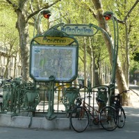
Some have disappeared, some have been altered beyond recognition, and some have been put to other uses. Quite a few, such as the Port Royal station, shown below, have become RER stations. (This is the Réseau Express Régional – the regional express network that is part of the Paris Métro system.)

A couple of years ago, when we were staying nearby, I enjoyed using this old-fashioned station, which has hardly changed since it was built in 1895. The book describes it as being in the “pagoda style,” much in vogue at the time for little stations like this.

Port Royal was on a short railway line that went to Sceaux, a suburb less than 10 km to the south of Paris. Originally, this line, which dates from the 1840s, stopped farther south at Denfert-Rochereau (another station that is still standing), but it was extended farther north into the city in 1890s with this stop at Port Royal and an underground terminus at Luxembourg. Today, all three stations are part of the RER B line.

Here’s another pagoda-style station. This stop on the RER C line is now called Javel, but it was once the Gare du Pont Mirabeau (which sounds so much more romantic).

Not all of the stations are in the same whimsical style. Boulainvilliers, a squat, defensive-looking establishment built in 1899 in the 16th, looks as if the railway owners were expecting the place to be attacked.

On the same line, a little farther to the northeast, is the former Courcelles-Levallois Station, now the Pereire-Levallois station, still in service on a commuter rail line called Transilien. This is one of several stations characterized by large, round-topped entry doors. The modern inserts are not very graceful, but with the original panes of glass, these buildings looked a bit like garden pavilions or orangeries.

A similar style is evident at the Passy-La Muette station, now a restaurant in the 16th, not surprisingly named La Gare. It was once a stop on the line between the Gare St-Lazare and Auteuil. The building dates back to the 1850s.

This is how it looked when it was still in service.

On the other side of the city, in the 12th, is the former Gare de Reuilly, now an annex to the Mairie of the 12th arrondissement. This photo from the Roger-Viollet collection shows it in the late 19th century.

I went looking for it on Google and found it at 181 avenue Daumesnil, looking none the worse for wear, still bearing the blue sign identifying it as a station.

Reuilly was the last stop before the terminus, the Gare de Vincennes, on the Place de la Bastille. In between was a raised viaduct with huge brick arches.

I found two postcards of the vanished terminus in our collection. The first shows it in context, facing the Colonne de Juillet (it’s the large building just behind and to the right of the Colonne). This postcard is dated 1922, but the image is likely some years older than that.

The second shows a closer view; the postcard was sent in 1907. Across the top of the building is written “Chemin de Fer de Vincennes.” Arrivals on the right and far left, departures second on the left and up a staircase (Escalier du Départ), baggage and parcels in the middle.

What I find interesting is that this enormous building was the terminus of a line that was less than 50 km long, and ended in the small town of Verneuil l’Etang. It seems a great deal of infrastructure for a fairly minor route. (Similarly, the Sceaux line was very short, yet well endowed with prominent stations.)

The Opera Bastille, a gleaming modern building of glass and metal, now stands where the Gare de Vincennes once stood. Flowers and trees grow along the top of the viaduct, and chic boutiques and art studios occupy the spaces under the arches below, in a nice example of adaptive reuse known as the Viaduc des Arts.

On the whole, Paris has retained more than half of its more than 50 stations, most of them incorporated into the RER system, with a few put to other uses. It’s an enviable heritage.

Indeed, each time we arrive from the airport after hours spent in a cramped seat in a sealed capsule, followed by a long taxi ride in rush-hour traffic on the highway and Périphérique, I envy travellers who arrive in Paris by train. The Eurostar, the TGV, the Train Bleu, the Orient Express…now that is the stylish way to enter the city.

So how many railway stations does Paris have today? The book lists 24 historic stations still in use as SNCF (railway), RER, or Transilien (commuter) stations and 9 new stations added to the network (most of them underground), so the correct answer would be 33.

Text by Philippa Campsie; historic photographs from the Roger-Viollet collection, “Paris en images”; contemporary photographs from Google Street View or by Philippa Campsie.

*Pascal Lambérieux, Paris et ses 50 Gares (Saint-Cyr-sur-Loire: Alan Sutton, 2010).

Posted in Paris history, Paris metro, Paris travel | Tagged , , , , , , , , , , , , , , , , , , , , , , , , , , , , , | 5 Comments

The art and purpose of the colonne sèche

The Parisienne colonne sèche is not a medical condition or procedure. However, a colonne sèche could be very good for your health, particularly in the event of a fire. There is no need to look hang-dog about it.

Paris is blessed with a richly imaginative design and artistic culture. In the image above, a few deft changes to an existing utilitarian object transformed a colonne sèche into an humorous bit of street art.

On a walk along the avenue Matignon, I noticed two muscular figures holding up a building on their shoulders.

They led me to this find: gorgeously sculptured door handles.

And to the most ornate colonne sèche I have ever seen.

So what is a colonne sèche and why might it be good for your health?

I had always known of them as standpipes. They are an essential part of fire fighting equipment for taller buildings. The water pressure from fire hydrants cannot raise the water beyond a few storeys. Moreover, fire hoses either have to spray on the fire from outside or be dragged up the stairs to the fire, and believe me, fire hoses are very heavy. Here is where the colonne sèche or standpipe saves the day when connected to another piece of equipment: the pumper truck.

The colonne sèche is a pipe to bring high-pressure fire-fighting water to locations inside a building. The water comes from a pumper truck which, when connected to the colonne sèche, pumps water to various parts of the building. Inside the building, one will find carefully folded fire hoses and nozzles already hooked up and ready to be pulled from a rack. Once turned on and connected to the pumper truck by the colonne sèche, the hoses are ready to go to work. The system is fast, reliable, and saves lives.

And as we shall see, most buildings have more than one.

This image provides a good picture of what is involved at street level. At the bottom we see two colonnes sèches. On each one, the end cap may be unscrewed so the hose from the pumper truck can be attached to the either or both. Reading the text we see each colonne sèche goes to either stairway (Escalier) A or B. At the top, we find a map to aid firefighters in finding the other ends of the colonnes sèches in the building and understanding the layout.

Here, one colonne sèche supplies water to the Central Stairway and the Basement level or underground level (Escalier Central et Sous-Sol). The other is near the Left Stairway (Escalier Gauche) but we are not told at which level, probably all.

This combination of signs first warns drivers not to park any time, day or night (Jour et Nuit), and then indicates that the colonne sèche is for the right staircase area (Escalier Droit).

I photographed this bank of colonnes sèches outside a Bureau de Poste (post office). We can see that the colonnes sèches are located at four stairways. For the first and second, the word montante (rising or ascending) and the arrows pointing up leave no doubt that these send water upwards. For the third and fourth, the arrows are pointing down or descendante (descending or falling). Note that the end caps are attached to the wall by a chain.

As Philippa and I walked along rue Marbeuf, she must have known I couldn’t pass this loading dock’s wonderful display without taking a photograph. Eight colonnes sèches (a personal best in this highly specialized category).

Look closer. Eight colonnes sèches but only six red labels. Each label has screw holes, but is actually held in place by double-sided tape. Numbers 3 and 8 are missing, leaving only the remains of double-sided tape. One suspects, and hopes, that at least in areas with a high concentration of workers, businesses, residents, and tourists, as well as valuable real estate, firefighters have digital data on interior layouts and colonnes sèches.

You now know more than you ever thought you would about something you have probably never stopped to consider. And why in a city as varied and gorgeous as Paris would I bother to look at such mundane things? Perhaps because the more you know, the more you see, and the more you see, the more you know.

And what we particularly want to know and see are the ways of reading Paris streets. This is why I muse about chimney pots and their trails they make on the sides of buildings. It’s why I take pictures of chasses-roues and read up on the the dual water system that keeps the streets of Paris so clean. I am endlessly fascinated by parking arrangements and delivery vehicles and anti-theft devices. It’s all about making sense of the city through its streets.

Text and photographs by Norman Ball

Posted in Paris civic functions, Paris streets | Tagged , , , , , , , , , | 7 Comments

In Search of Lost Time

You don’t really need a wristwatch in Paris. For one thing, you are never far from a clock – on walls, towers, and in front of boutiques. Some are ornate.

Some are utilitarian.

Some are advertisements.

Some are art.

Of all the clocks in Paris, perhaps the most extraordinary can be found in the Maison Rouge, where we went to see an exhibit of neon art. In the café near the entrance to the toilets, there is a clock with what appears to be a man standing inside.

Every few minutes, he erases the hands and redraws them with a marker from the inside. I suppose it is some sort of film loop and projection system, but it is remarkably realistic.

There is another reason why you can leave your watch at home. You simply may not care what time it is, or even what day it is. Sometimes you just slip out of the present and into somewhere else. You turn a corner and you are no longer in the 21st century.

Woody Allen’s movie, Midnight in Paris, is all about time travel, but it’s about the people of the past, not the city itself – the hero gets to meet his literary and artistic idols, from Ernest Hemingway to Salvador Dali, as he prowls the city after midnight.

And of course, that film was shot in contemporary Paris, and the streets look much as they do now, but without cars, modern shopfronts, or advertisements.

If one really did go back, there would be more striking differences. The trees would be smaller, or absent. The buildings would be darkened with smoke. And, as Adam Roberts pointed out in a recent post on Invisible Paris, there would still be chaotic traffic, but it would be partly horse-drawn. And it would be smelly.

One night , I fell asleep after spending the evening sorting through some 100-year-old postcards of Paris. I dreamt I was sitting on a bench on Paris street, and I noticed among the crowds a few people dressed in what appeared to be period costume (women in long dresses, men in frock coats). I assumed they were animateurs for some historic re-creation.

But as I looked around, gradually I saw fewer and fewer people in modern dress, until they disappeared altogether, and I saw only people in old-fashioned clothes. At that point, I realized I had done it – I had gone back in time. Excited, I got up from the bench and walked to the end of the street. When I turned the corner I saw… construction. Several large buildings covered in old-style scaffolding. Ah yes, the past was also full of demolition and construction in Paris.

My next thought was: Where should I go, now that I am back in time? What should I see while I’m here? I went into a building and found what looked like a library. I suppose I was going to ask for a map or a guidebook of Paris as it then was.

The dream took an odd turn at that point, although I was still back in time,* but when I woke up, I pondered the question, and I’d like to ask readers their ideas, too.

If you found yourself in Paris 100 or more years ago, where would you go?

My first thought was: Les Halles. I’d want to see the markets when they were still working and filled with life.

I’d like to take a ride around the city on the Petite Ceinture and see all the little stations that have since disappeared.

And, of course, I would visit the Grands Magasins Dufayel in its glory days to see the magnificent staircase and the grand galleries and admire the tower topped with a searchlight that once beckoned customers. You can see the dome on the right in this postcard view.

What about you? Where would you go?

Back in May, when I was photographing clocks in Paris, I found one that seems to me to represent lost time. Behind the Musée Carnavalet, there is a little garden called Square Georges Cain, named for a former curator at the museum. On the wall of the museum are some odd architectural bits and pieces, salvaged from demolished buildings, including this fragment of a façade, with a clock that has stopped forever.

It is part of the long-gone Tuileries Palace. It was one of two clocks in the centre of the façade – one facing the Champs-Elysées, the other facing the Louvre. The building was torched in 1871 and stood as a burnt-out hulk for 11 more years before it was finally torn down. Somebody (Georges Cain?) saved this bit as part of the city’s history and installed it in this quiet corner of the Marais.

It’s a good place to sit and think, and to decide on one’s strategy, just in case time slips sideways and lands you in the past.

Text and photographs by Philippa Campsie

*So what happened in the dream? I found myself by the canal, but the banks were grassy and undeveloped and the huge trees were not there. A woman nearby fainted or collapsed and people called for help. A boat drew up and a man got off, saying he was a famous doctor and could help. Somehow, in the way that one “knows” things in dreams, I “knew” I was seeing a historic incident, but when I woke up, I have no idea what it might have been.

Posted in Paris history, Paris nostalgia, Paris postcards, Paris streets | Tagged , , , , , , , , , , , , , , | 13 Comments

Finding Typewriter History in Paris

My five-year-old grandson doesn’t know what they are. Actor Tom Hanks collects them. And I am so captivated by their beauty and their astounding variety that I am writing a book about them, in collaboration with Martin Howard, another well-known collector. What are they? Antique typewriters. Martin’s website conveys some of the extraordinary range in the machines created before 1900.

So when Philippa and I went to Paris recently, the search for typewriter history inevitably entered the picture.

For starters, I wanted to find 42, rue Vivienne. I was tracing the story of Frank Lambert of Brooklyn N.Y., formerly known as François Lambert of Lyon, France. François/Frank was an inventor who made most of his money with a water meter, but later became known for the typewriter design that bears his name. It is probably my favourite of all antique typewriters.

In France, the manufacture and sale of Lambert typewriters was controlled by one Sidney Hébert, who had a factory in Dieppe. Hébert listed himself as Lambert typewriter maker “for the entire world.” His Paris address was 42, rue Vivienne.

Number 42 has a central entry and two store fronts each with separate street level businesses. Each buys and sells gold ingots and coins, as do a number of other nearby businesses. Next door at 40 is the two-star Hotel Vivienne.

Another port of call (pardon the pun) was the Bassin de l’Arsenal near the Place de la Bastille. Twice a year, both sides of the basin are lined with about 350 dealers in the Antiquités Brocante Bastille presented by the Joel Garcia Organisation. Among the dealers in furniture, silver, and porcelain are a few who deal in paper and postcards. I asked one dealer if he had any postcards featuring typewriters. He looked in his boxes and pulled out a handful for me to look at.

This is one of the first I looked at. In addition to typewriters, the photo is about costume and social position. The wasp-waisted teacher is quite elegant, while two of the students appear to be wearing smocks over their clothes.

The students are using three different kinds of equipment, and I asked three typewriter collectors if they could help me identify them. Three experts, Martin Howard, Peter Weil, and Richard Polt, agreed that the typewriter shown on the left was a Yost, Model #10. Why are there so many rows of keys? There was one set of keys for upper case and another for lower case.

The woman next to the teacher is using a “court reporting stenographic machine” that Peter Weil suggested could be the French-made Stenophile. A court reporter might be expected to capture as many as 300 words per minute. The continuous paper roll meant that no time was wasted inserting new pieces of paper. Stenographic machines had fewer keys than the conventional typewriter and rather than typing single letters consecutively one typed a number of keys at the same time to produce what, to the knowledgeable, could be interpreted as syllables, words or phrases. This method of typing is called chording and allows speeds vastly superior to a conventional typewriter if one knew the appropriate shorthand method such as Pitman.

Finally, the woman in the centre is using a practice keyboard, where in addition to learning keyboard layout, one could practice smooth rhythmical typing.

The above postcard image from the same dealer shows a typewriting class or school in Pont-de-Beauvoisin. It offers a small clue as to how postcards were produced. Postcards were printed in sheets and then cut to make individual postcards. Part of the bottom line of text is missing because the machine was either not set up properly or the sheet had not been fed in straight. Even though the tops of the letters on the bottom line are largely cut off, you can make out the words “Salle de Dactylographie” (typewriting class).

It appears to be a rather spartan conventional classroom with four typewriting tables added at the back, along with the Underwood keyboard guide on the wall. Note that the keyboard guide is for the French “AZERTY” layout rather than the QWERTY. (Still a problem for English visitors to France who use Internet cafés!) Peter Weil examined the photo and concluded two of the machines were Underwoods and one was an LC Smith, probably about 1910 or later.

The dealer also had some typewriter ephemera from the Paris Exposition of 1900.

I love the design and the colour of this postcard. Peter later told me that the Smith Premier No. 4 had won the gold medal at the 1900 Exposition. A few days after Martin Howard saw the card, he suggested I might want the actual typewriter to go along with it. It just so happened that he had been approached by someone looking for a good home for a Smith Premier No. 4. I am now the proud owner of one of these machines.

Perhaps the most unusual item I bought from the dealer at the Bastille is the image below.

It invited the recipient or reader to try out the “perfected” new models for free, phone the Paris office, or visit at 8, boulevard des Capucines. But who got this invitation? The next image gives us the answer.

The Remington ad we looked at was on the back of a receipt, dated 1 September 1912. It documented payment of an announcement in the newspaper L’Écho de Paris. No ordinary announcement, an obituary. You can see a scrap of the tear-off sheet, which, Philippa discovered, refers to Comte Charles de Villelume de Sombreuil, who had died suddenly at the age of 51 in his home at Versailles a few days before.

Just in case one was not inclined to read the Remington ad, the lower left side of the receipt side had a message enclosed in funereal black outline, “Important Notice Remington Typewriter Co. (See other side).”

Perhaps whoever paid for the announcement took the receipt and stuffed it in a file. Perhaps he or she read the ad and marched off to 8, boulevard des Capucines and bought a typewriter. Who knows? But almost exactly 100 years later, I went to find the Remington offices myself.

Early on a holiday morning I walked up to the imposing doors.

Perhaps the Remington office had been on the ground floor with plate glass windows looking out onto the passing scene. Perhaps they were in one of the upper floor offices. Clearly the building was in a good area. I noticed two medallions near the top of the door opening.

What is Sir Thomas Gresham (1518-1579), London merchant, one-time mayor of the City of London, financial agent for Henry VIII and Queen Elizabeth I, and founder of Gresham College, doing here? Turns out that this building once housed one of the Paris offices of a British life insurance company called The Gresham.

There is also a plaque beside the door.

In this house
Where he died, the illustrious musician
[composer] of “Parisian Life”
of “Orpheus in the Underworld”
of “The Beautiful Helene”
Jacques Offenbach
(20 June 1819 – 5 October 1880)
Composed “The Tales of Hoffman.”

So I bid au revoir to the imposing doors and the memory of Jacques Offenbach but I will be back in search of Remington.

Finally, our trip to Paris coincided with one of the great antiquarian book fairs of the world: The Paris International Antiquarian Book Fair.

The event was held at the Grand Palais, built for the 1900 Paris Exposition. The setting was perfect for the displays of rare, antiquarian books and artworks. Already, we are wondering if we can attend the fair in 2013.

To get a sense of both the fair and the building, click here for the Book Fair Video. The music you are hearing is from the periodic live concerts that took place throughout the fair.

The selection of books, manuscripts, and art was overwhelming. After some pondering, I bought an original hand-painted piece of advertising artwork for Remington typewriters. The address was familiar–8, boulevard des Capucines–and I had already been there.

Elsewhere in the book fair, we could see other collectors finding their own treasures. Paris is made for people with passions who like to browse and sometimes buy. Part of the great joy of collecting is taking your interests with you wherever you go. You might be surprised by what you find. We recommend you do it in Paris.

Text and photographs by Norman Ball.

With special thanks to Martin Howard, Peter Weil and Richard Polt.

Lambert typewriter image and 1897 Remington ad courtesy antiquetypewriters.com

Posted in Paris expositions, Paris history, Paris postcards, Paris typewriters | Tagged , , , , , , , , , , , , , , , , , , , , , , , , , , , , , , , , , , , , , , , , , | 14 Comments

Le Bazar de l’Hôtel de Ville

Sooner or later, we know, we will end up having lunch at the Cantine in the BHV (Bazar de l’Hôtel de Ville). It’s central. It’s inexpensive. The food is good. The view from the big windows is magnificent. And of all the Paris department stores, it’s the most approachable. It’s not as big as Galeries Lafayette, nor as beautiful as Printemps, nor as trendy as Le Bon Marché. But it’s a reliable place to find what you want, from lunch to lightbulbs to luggage to lingerie.

This time, we were entranced by the illustrations on the cafeteria walls. They were pictures of culinary tools, paired with the objects from which they took their names. A mandoline (for slicing) with the musical instrument. A chinois (cone-shaped sieve) and a Chinese hat. A diable (a small casserole dish) and a picture of the devil. An araignée (skimmer) and a spiderweb. About a dozen pairs in all.

The series had been created for BHV by Sabine Forget, a Paris artist who does delightful watercolours and pen-and-ink sketches. As we ate our poached salmon and salad, we studied her pictures, enjoyed the wordplay, and added some new terms to our French vocabulary.

After lunch, we took the escalators back down to the ground floor and walked out to the street. I began to notice things about the BHV I hadn’t registered before.The back of the building doesn’t resemble the front, and the front doesn’t resemble, well, anything much. There’s a Belle Epoque dome at one end and a plain, squarish entry at the other end and in between is a series of traditional-looking buildings with more modern storeys on top of some of them.

The photograph I took at the time didn’t capture that very well, so here is a Google Street view, taken from the end away from the domed entry.

The other side of the store looks more like a purpose-built grand magasin, with big windows and imposing columns. Odd.

The satellite buildings nearby (the pet store, menswear, bicycles) offer unexpected treats – a growing green wall, for example, and a second café in a pleasant courtyard near menswear. But they are not connected to the store architecturally. The overall impression is that there is no overall impression. This is an architectural mishmash of a store.

It got me thinking about department stores in general. They are one of the distinct cultural institutions in Paris and they seem to be holding their own there, even as those in other countries struggle to survive. When I was a child growing up in Toronto, the two big department stores were the T. Eaton Company and Robert Simpson’s – imposing downtown buildings with brass-trimmed revolving doors (I got my arm caught in one when I was about six years old and caused quite a stir when I had to be extricated) as well as complicated elevators operated by smartly uniformed women in white gloves who handled the controls and announced the floors (“Third Floor: Shoes, Lingerie”). Both companies have long since been bought out by others (Sears, Hudson Bay) and both are losing ground to monotonous suburban big-box stores with fluorescent strip lighting, industrial-style shelving, and cheap merchandise.

French department stores seem to have fared somewhat better, although many have perished along the way. Who now remembers that Les Deux Magots was a department store before it became a café frequented by existentialist authors? Or that Pygmalion was the name of a Paris store before it was a play by George Bernard Shaw? Will La Samaritaine ever reopen in some semblance of its former glory? Do any traces remain of the Grand Bazar de la Rue de Rennes underneath the dreary exterior of the current Fnac outlet? And why does no one remember the flashiest of them all, the glorious Grands Magasins Dufayel, with its dome and searchlight, which was once a huge tourist draw and is now largely forgotten?

Somehow, as these have vanished over the years, the Bazar de l’Hotel de Ville has persisted.

The founder, Xavier Ruel, started small. He had a business selling small items and trinkets from carts, and his employees fanned out around the city, selling their wares on the sidewalks. During the disruptions of the Haussmann period, when half the city was being knocked down and new construction was everywhere, mobile carts made sense. But Ruel discovered that the salesman who parked his barrow opposite City Hall was earning many times what the other employees brought in. Location, location, location. Ruel decided to rent the ground floor of a building in that spot for a little boutique he called the Bazar Parisien.

In 1860 or so (accounts differ), his business got a boost from royalty. The story goes that Napoléon III’s wife, the Empress Eugénie, was passing in front of the sales carts on the rue de Rivoli when the horses pulling her carriage took fright and bolted. Ruel, who was standing nearby, had the presence of mind to catch the reins and calm the horses. The Empress later sent him a sizable sum of money to show her gratitude.

The reward allowed Ruel to expand his operations until eventually, his store occupied the entire block. He renamed it the Bazar Napoléon in honour of the Emperor (husband of his benefactress). But with the fall of the Empire in 1871, that name became politically incorrect. So Ruel again renamed his establishment, this time after the Hotel de Ville across the road – which itself burned down in the 1871 conflict and had to be rebuilt.

Ruel died in 1900, at the age of 78, by which time his department store was a going concern with 800 employees. The business passed to his nephew, since he had no sons.

At that point, the store still occupied the various buildings that Ruel had acquired piecemeal over time. The other grands magasins had flagship stores created by the “starchitects” of the time. Why not BHV?

According to the architectural histories I have found, some improvements were made in 1903-04 and then a new building was created in 1912-13 by the architect Auguste Roy. But when you look at the building, it it hard to figure out who did what.

Was it Roy who designed the grand dome on the corner and the purpose-built section on the north side? Whatever happened in 1912-13, it seems to have been a retrofit, not a new building. This would explain why the place lacks a glorious atrium and glass roof, which characterize many of its competitors, and why the interior is often hard to navigate. The photo below shows the juxtaposition of two of the building styles that make up the BHV.


It also appears that Auguste Roy was far from being a “starchitect” of the calibre of Paul Sédille who created Printemps, or Gustave Rives, who made the Grands Magasins Dufayel into a glittering tourist draw. Roy and some colleagues had won first prize to design a primary school once. He’d done an apartment building or two. Hardly a sought-after name-brand architect.

Despite some belle époque flourishes, the BHV cannot really be considered an elegant venue. The interior ceilings are low and covered with acoustic tile, and the elevators can be hard to find. Nevertheless, it is the go-to place for hardware, kitchenware, toys, stationery, and art supplies. We’ve bought everything there from clothes to colanders to Sophie la Girafe (for a grandchild).

Today, thanks to consolidation, it is owned by the same folks who run the Galeries Lafayette and Monoprix, but it maintains its own personality.  And there are still carts out front, selling toys and trinkets – Xavier Ruel would approve.

The basement hardware department is legendary, but alas, the little bar in the form of a handyman’s workshop, where we used to stop for a glass of wine after negotiating the maze of tools and DIY supplies, has gone.

So now we head upstairs to the cafeteria with its big windows and affordable poached salmon, and look out over City Hall and the river.

Nineteenth-century department stores used to offer a home away from home for shoppers (with everything from lending libraries to writing rooms with monogrammed stationery to children’s playrooms). For us, the BHV is that welcoming space where we can alight temporarily in the middle of a bustling foreign city and feel at home.

Text and photographs by Philippa Campsie

Posted in Paris architecture, Paris shops | Tagged , , , , , , , , , , , , , , , , , , , , , , , , , | 9 Comments

Berthe Morisot, an artist ahead of her time

Dear Parisian Fields subscribers,

If you enjoy our postings about art, we hope you will enjoy an article on the Impressionist artist Berthe Morisot that Philippa wrote for the website Girls’ Guide to Paris.

The article begins: “It is said of Ginger Rogers that she did everything Fred Astaire did, but backward and in high heels. Similarly, Berthe Morisot did everything her fellow French Impressionist painters did, but in a corset and with a chaperone beside her.”

Read more >>>

Hope you enjoy it. We’ll have a new posting on our own blog this weekend.

Norman and Philippa

Posted in Paris art | 6 Comments

Richard Ewen: A Texas Artist Whose Watercolours Capture Paris

Richard Ewen is a talented watercolour artist who lives in Austin, Texas. He loves Paris, visits it regularly, and then, back in Texas, creates marvellous paintings of Paris, many of which are based on reflections in shop and café windows.

Watercolour painting is an exacting art, because unlike oil painting, you cannot just cover up your errors with more paint. And any artist can tell you how difficult it is to master the technique of painting reflections. To do so in such an unforgiving medium as watercolour makes Ewen’s work even more impressive.

Consider the painting he calls Guess Who’s Coming to Dinner.

Richard’s paintings begin with his walks, a keen eye, and his camera. He recalls, “I stopped dead in my tracks when I saw the table setting and the car reflected so that it looked as if it was inside the restaurant.”

Recently, we met in Paris and he told me more about how his paintings come about. It begins with the original photo.

In an e-mail, he explained his method for moving from original photo to painting.
“I work in Photoshop and do the following:
1. Crop the image. I like to get rid of the architecture of the building and the window, no matter how interesting it is, so that there is a little mystery to the first look at the painting. “What is this?” or “Why is the lettering backwards?”
2. Skew the image to be square with the picture plane.
3. Adjust the shadows to bring out details and adjust the highlights to reduce any glare.
4. Increase the color saturation.
5. Brighten the image and set the contrast.”

These procedures give Richard what he calls the “altered photograph” we see below.

The altered photo does not become the exact painting, but it is a crucial step in the process. As Richard explains, “It is important to get the photograph adjusted to the colors and brightness that I want in the final painting. I start painting with light and thinned bright colors first, and try to get colors in every area before strengthening them and darkening the shadows. In other words, bring in the colors lightly at first and then stronger as I keep layering the paint.”

The expression “layering the paint” is a reminder of just how much planning and prevision his work needs. Because he works in watercolour, he has to get it right the first time, so naturally he works carefully. After he has decided on all of the details for the painting, he draws it in pencil on a special translucent paper. Here he must be careful to clearly indicate how the colours will be applied and built up to give the reflections he needs.

Then he takes the watercolour paper on which he will paint and puts a piece of transfer paper—rather like the carbon paper of old used for typewriters—over it, topped by his drawing of the painting. He retraces the lines he made on the translucent paper so they will be transferred from the transfer paper to watercolour paper. Only then does he start painting.

I will leave it to you to examine and re-examine the three images for Guess Who’s Coming to Dinner and to look for changes. Notice, for example, how the structure of the double red doors have changed, how shadows have been sharpened, as have the chasse roues. What has happened to the reflections in the wine glasses or the look of the tablecloth?

Now let us consider “Plage 13.” Plage means beach. It too started with a photo he took one day, but let us look first at the finished painting.

In an e-mail Richard explained, “Plage is the backdrop photo that the window decorator installed behind the mannequins. A beach scene with tropical palm trees and exposed figures on the beach in tones of red and yellow and tan. In the lower right-hand corner you can make out a chid wrapped in a floating device or inner tube. The silver post is a structural element in the store and there is a traffic light positioned near it. At the top of the post the shade from outside ends the visibility of the post and the reflection of the building from across the street takes over. There is printing on the window that says Prada, Milano, 1913” (1913 is the year Mario Prada founded his label).

I have not seen the original paintings, but as I increase the size of the images on my computer screen, I see more and more details, more and more story. Surely many readers have had the same experience with a scanned image or their own photos, which reveal details that are only visible when enlarged. Richard explains that this element of surprise is an important part of how his paintings emerge.

“One of the features I like about these images I take is precisely the detail that comes forward upon inspecting the photograph on the screen after it has been enlarged. The complicated subject matter and haphazard juxtaposition of shape and objects create a very interesting composition and hopefully make the viewer see something new each time he or she views the painting.”

The image immediately below is the altered photo. I leave it to you to find the additional details that emerge as you continue to look at it.

The photo shown below is the original window as photographed by Richard.

In the next painting, titled “Christian Lacroix,” let us start with the original photo.

Richard “liked the broken cubist-like image and the purple and gold.” In the original photo, Richard as photographer is clearly reflected on the left. There is also no mistaking that this is a store window. Looking at the altered photograph below we see a new image and focus emerging as he crops, zooms in, and makes other subtle alterations.

Here is the finished painting that emerged.

Richard did this painting for the assistant in the Austin gallery that exhibits his work. It seems a far cry from the original and yet is clearly connected to the original and retains the same essence.

Artists help us see more clearly by helping us see differently. Perhaps this is why I spend so much time in art galleries, thinking of all manner of art works and, when I get the chance, talking with artists about their work.

As I have explored Richard Ewen’s website I have found myself returning to several favourites. One is the opening painting in the blog, the one with the gorgeous reflections of the car in the restaurant. The other is Le Grand Café.

It started from a photo that Richard says “appealed to me because of the intense red.” (I too like “intense red.” I have a bright red bookcase in my study and a stained glass piece in the window with a triangle of deep red.)

Richard’s café looks very inviting. The red is energizing, yet the overall scene is calming. As a good café does, it draws you in and suggests possibilities, while creating a cocoon-like private space of energy and calm when one needs it. Le Grand Café started with an unnamed café he photographed one day in Paris.

The cigarette butts and debris suggests that the crowds have gone. It could be closing time or very early morning; it does not matter. There is a slash of light on the chair back and an empty table. We see the bottom of equipment on the bar counter and light reflected from floor to the front of the counter. Then Richard started to change the scene.

The cigarette butts are still there, but the equipment on the bar has all but disappeared. The floor pattern is still reflected on the front of the counter and the table is still empty.

Now let us revisit Le Grand Café and reflect on how one man has helped us see Paris anew.

Revisiting the works of Richard Ewen has been particularly enjoyable for me. Among other things, they are a reminder of a wonderful lunch and afternoon in Paris this past April. Richard and I knew of each other’s work through Parisian Fields, but had not met. And yet at the lunch that Philippa and Richard had arranged, it seemed as if we were old friends. After lunch, Richard, his wife Mary, Philippa, and I spent a delightful afternoon wandering about the 5th arrondissement, visiting their apartment, and enjoying the company of new friends.

This is one reason why Philippa and I write this blog: we love Paris, love the new sights and experiences we find each time we visit, love to write about those sights and experiences, and love the way it allows us to connect with those who share our enthusiasm for the city.

I thank Richard for his generosity in helping me understand his work, answering my questions, letting me use his images, and above all helping me see Paris anew. Perhaps we need to feature more artists in Parisian Fields. What do you think?

Text by Norman Ball; photographs and illustrations by Richard Ewen.

Posted in City of Reflections, Paris art, Paris shops | Tagged , , , , , , , , , , | 11 Comments

Lighting the City of Light

Opinion is divided on whether the name “City of Light” refers to the brilliant minds of the city’s 18th-century philosophers, or to the brightly illuminated streets of the capital. There are arguments to be made on both sides.

If the latter is correct, there is no question that Paris works hard on its illuminations. As I photographed streetlights here and there, I couldn’t help wondering at the many different styles, and about the logistics of replacing bulbs and carrying out maintenance in a city with as many types of lamp standards as France has cheeses.

Even on a single street, one can see several versions. The Champs-Elysées has tall modern standards that do the main work of lighting the boulevard, and shorter, old-fashioned ones that provide atmosphere and elegance on the sidewalks.

This one near Les Invalides combines old-fashioned style with modern practicality on a single pole.

Each bridge seems to have its own version, from the elaborate lamps on the Pont Alexandre III…

… to the hideous modern ones on the Pont de l’Alma.

Some streets are too narrow to have lamp standards, so the lighting is attached to the walls of buildings.

It has taken more than three centuries to achieve this array of lighting in the city. Before the 16th century, Paris went dark when the sun set. Then the government formed a plan to require householders who had ground-floor windows overlooking main streets to keep a light burning, at least in the early hours of the evening. These lamps were to be provided by the authorities. But the cost of making and distributing them was too high. Paris stayed dark.

Someone suggested a system that would allow citizens to temporarily hire a torch from a network of torch-renters spaced at regular intervals – rather like a Velib’ system for light. There were no takers.

Public street lighting really began in the 17th century under the Sun King, Louis XIV. The lights were hung from ropes stretched across the streets. They consisted of a tallow candle in an iron-framed glass box. (Later, the candles were replaced with oil lamps.) There was even a plan to finance the system. Householders would pay a tax that covered both street cleaning and streetlighting (taxe des boues et des lanternes). This is one of the origins of today’s property tax – that necessary and unpopular civic obligation.

At first, the system required residents to participate by lowering the rope from an upper floor when the lamplighters approached, signalled by the ringing of a bell. Bad idea. Householders were seldom available or willing to act when they were needed. Eventually, mechanisms that lowered the line from the ground were installed, and protected in a locked box that was accessible only to lamplighters (a job outsourced to freelancers by committees in each district of the city).

Gabriel Nicholas de la Reynie, considered Paris’s first modern police chief, is credited with these first ventures into lighting infrastructure. Parisians may have mixed feelings about La Reynie: the street named for him is an insignificant two-block pedestrian way crossing the boulevard Sebastopol. La Reynie, one senses, may have stepped on some fairly significant toes in his quest for law, order, and good street lighting.

Reynie’s invention worked…most of the time. The lamps on ropes were easy targets for drunken miscreants, who liked to smash them as they passed. When the police responded by placing the ropes even higher up, ne’er-do-wells simply cut the ropes to enjoy watching a lamp plummet to the pavestones and smash to smithereens.

Lamps attached to buildings were slightly less vulnerable. But in the Revolution, these gallows-like contraptions were used for hangings. When you heard the expression, “A la lanterne!” it meant somebody’s number was up.

Revolutions and streetlights don’t mix. In subsequent upheavals (1830, 1848, and so on), lights were often smashed to allow rebels to move through the streets without being observed. Since the police were the originators of streetlighting (and lighting expenses were paid through the police budget), these lights were seen as symbols of official control. If the “City of Light” really does mean the City of Streetlights, not everyone wholeheartedly embraced this technology, or Paris’s light-filled reputation.

Gas light replaced the oil lamps in the 1840s. This was a bigger change than it sounds, because oil lamps are individual affairs, filled one at a time, but gas requires a centralized delivery system to each location. No doubt taxes went up.

Electricity arrived in the mid-19th century. The first electric street lights were bright, glaring arc lamps on very high poles that not only cast a harsh light, but also created very deep shadows. They were expensive, and used only in very well-frequented places, while the side streets kept the softer gaslights.

Today, Paris is subtly and carefully lit and each monument has its own customized lighting system to show it off to its best advantage … until a Bateau Mouche passes with its violent searchlights scraping the facades of the riverside buildings. The City of Light shines a bit too brightly then.

Text and photographs by Philippa Campsie

Posted in Paris civic functions, Paris streets | Tagged , , , , , , , , , | 11 Comments

The meaning of two wheels and a motor in Paris

It is glorious to walk the streets of Paris and revel in the colour, especially after hours in the cramped unbearable beigeness of an airplane. (Whatever happened to the use of the word steerage?) We were grateful to be on the ground and surrounded by such beauty. This is one of the first photos I took on a May afternoon last year. Sometimes I see Paris through the colours and images of motors and two wheels.

We had started to sate our need for beauty and colour in Artcurial, then in a few shops on the Avenue Montaigne. Surrounded by conspicuous prosperity, I caught sight of the bright orange and subdued grey paint of a Triumph motorcycle. In pursuit of an interesting photographic angle, I knelt to peer closely at the exhaust pipe, cylinder head, and braided stainless steel line shown above.

The sidewalk was crowded. Philippa is not usually surprised when I stop or wander off with my camera. But this time she whispered: “What are you doing down there?” I was unaware of the small crowd I had attracted until I walked away. I looked back and saw 5 or 6 people bent over the motorcycle, peering at it. One was even kneeling. We had a private chuckle and later Philippa told me how much she liked that shot.

Many of my memories of Paris are expressed in reflections. This is what happens when one walks slowly and stops often. A passing blur becomes a building etched on the windscreen of a Piaggio.

In the shot below, my attempt to capture the vivid blue, bright chrome, and curves that reflect the surroundings almost into pure abstraction brought another accidental crowd. The same thing happened as I captured some exhaust pipe and muffler studies I might use for another purpose.

Sometimes the makings of vivid memories just jump out. I like red. The red on this motorcycle screamed at me, a welcoming scream, I might add.

Screaming red and voluptuous bodywork deserved a full stop and some major gawking. That was just the beginning. I looked closely. This stunning piece of machinery was an MV Agusta and when I saw it I had no one to share my excitement with.

I might have been a bit incoherent and reverently mumbled something about “Meccanica Verghera Augusta.” I had read about such machinery from my teens but never seen one this close. MV Augusta, a company founded in 1945, made its first motorcycle the following year and also won its first race the same year. Many times a World Champion.

Ah Paris, you are so good to me.

I spotted this Honda about the same time as the owner spotted me. It had an appealing chunky design and the orange and chrome winked at me in the sun. As I recall, someone asked why I was looking at the bike. I told him it was very good looking and I like motorcycles. He just stared at me. I asked if could take a picture. He nodded and said he worked in the store right behind us. He walked off, but his eyes stayed on me.

Sometimes brightly coloured wheels seem too joyous to ignore.

As many know, Paris (with or without champagne, absinthe, or wine) can be very intoxicating and disorienting. Here a lonely scooter helps us decide which way is, well, down.

The anthropologists and art historians tell us we decorate ourselves as a means of expressing both individuality and belonging to a group. Sometimes the symbols are fairly straightforward. And I recognize the one below. But plastered all over the windscreen of a scooter in the heart of Paris? I’ll let you work on that message. Let me know your theories or stories.

In Paris I also enjoy distinctive motor sounds and have often surprised Philippa by identifying them by name before we see the source. I ask, who could not possibly appreciate the differences between the sound of a Ferrari in full scream and a Porsche winding up into its own roar? Or not physically feel the spine-tingling, ear-biting whine of a high-revving, motorcycle engine just shy of the redline?

What do two wheels and a motor mean to me? I have tried to share the beauty and the wonder, and how they reflect the familiar into the newly almost-familiar. But there is something else. Despite all the light-change drag races on rue de Rivoli, two wheels and a motor in Paris mostly say quiet and remind me of walking home. I started to feel at home in Paris — even though regrettably it has never been our full-time home — when we rented an apartment in the Marais. We rented it three times and the sight of this lone motorcycle and a relaxed French flag still reminds me of that time and says home.

Text and photographs by Norman Ball

Posted in City of Reflections, Paris automotive | Tagged , , , , , , , | 6 Comments

The bouquinistes and the photographer of shadows

To quote from last week’s blog by Norman: “The sense of continuity is part of the fascination of learning more and more about Paris.”

But it’s not just about the continuity of major monuments and landmark buildings. It’s also the year-in, year-out sight of sidewalk cafés and Wallace fountains or the smell of the Metro (some people hate it; I am not one of them) or the yee-haw sound of police cars fighting the traffic. And among these elements of continuity there is one that never fails to surprise me in its persistence: the bouquinistes by the Seine.

Every year, I am amazed that in the days of iPads and eBooks and all those other things that start with single lowercase vowels, there is a place for the sale of faded copies of Paris Match, dog-eared pulp fiction, and recycled editions of the classics. How do these people survive?

From a book called Paris: Discovering the City of Light,* I learned that there are about 250 bouquinistes, all of whom are officially registered with the City, as they have been since 1891, although the open-air booksellers were operating long before this regulation took effect. The city stipulates the colour of the boxes (dark green), the dimensions (8.2 metres long and 1.1 metre high), and requires the concession holders to be open at least four days each week.

But it was the information uncovered by David Downie in Paris, Paris, that really surprised me. There is a waiting list for those 250 spots, and people spend an average of four years waiting to get a box of their own. And the average age of the bouquinistes is going down, not up. Downie suggests that this is “proof of the profession’s stubborn vitality or, perhaps, an indication of a desperate economic situation that drives the young toward marginal businesses.”** Maybe it’s a bit of both.

Downie regularly frequents the bouquinistes’ stalls and has talked to them about their lives. One, a fourth-generation example of the species, told him that they really survive by selling souvenirs and tourist knickknacks, but they are required by law to devote a certain proportion of space to books nonetheless. The books come from flea markets and yard sales in suburbs and small towns. Some of the bouquinistes specialize – one focuses on books about jazz, for example, another on books on his native Brittany, still another on books published by La Pleïade.

About 90 years before Downie published his book, another flâneur took an interest in the bouquinistes. The photographer Pierre Petit, better known by the single name “Yvon,” one day came across an old bookseller wearing a shapeless hat, a cloak over his shoulders, and wooden sabots on his feet. He was sitting on a folding stool and smoking a pipe. Yvon asked if the bookseller would pose for a photograph. Times weren’t good then either (this was just after the First World War), and the man, who was tired and about to close up for the day, asked for payment. Yvon gave him five francs and proceeded to take what is probably the most popular and frequently reproduced image of the bouquinistes.

Actually, there are at least two very similar images, one in landscape format showing the length of the sidewalk with people browsing in the book boxes in the background, and a second in portrait format taken closer to the subject and showing him alone, with Notre Dame behind him. I have postcards of each the two images both in black and white and after colour has been applied to each image.

The landscape version shows evidence of retouching (in the days before PhotoShop, this was done on the negative). There must have been a barge on the river with some kind of hoist that was visible just beyond the man, and Yvon has made an effort to minimize it. You can just see a sort of triangular shape in the gap between the boxes. Obscuring it made the man’s profile a bit clearer.

In the portrait version, Notre Dame seems to be wreathed in mist. This is a typical Yvon hallmark. Photographers of the day who took landscape shots for use as postcards tended to shoot in full sunlight. Come to think of it, most contemporary postcard photographers still do this, with bright blue cloudless skies (when people use the term “picture postcard view,” this is what they mean).

Yvon, however, went for the mood shots – early mornings or dusk rather than noon, rainy and misty days rather than sunshine, and off-seasons rather than high summer. He was one of the first to photograph the fierce gargoyles on the top of Notre Dame against a turbulent sky, creating images that have inspired generations of gothic mystery writers and film noir cinéastes.

Yvon bought his first camera at the age of 12. He stole some money from his father to do so, but his father recognized passion when he saw it and apparently forgave him. He went to work for an electric company before the First World War, but spent his free time as an amateur photographer. A bout of polio as a child had left him with a deformed foot, so he was not sent to fight when war broke out. After the war, he began to provide photographs for a magazine called l’Illustration. He used the pseudonym Yvon (a family name) because there was already a well-known portrait photographer who shared his real name, Pierre Petit.

Yvon’s work in l’Illustration was popular, and the editor suggested Yvon use his images for the hot new medium of the time – the postcard. Yvon invested his own money in printing a series of postcards of his distinctive views of the city, and he took the unusual step of including his name on each image. These were not the routine shots of famous buildings typical of postcards at that time, but artistic images born of Yvon’s wanderings in the city, looking for unusual angles or juxtapositions, and playing with the effects of shadows, mists, clouds, and reflections.

Yvon eventually quit his job at the electric company and founded his own company, Editions d’Art Yvon. At first he did it all – managing the printing, the shipping, the sales, and the accounts. Later, he hired some assistants for the office work so he could devote himself to photography. Apparently he was not much of a family man (he had a wife and three daughters) and preferred to be out with his camera. As his business grew, he travelled all over France taking images for his distinctive branded postcards.

In the 1930s, the postcard business was booming, and Yvon did well. During the Second World War he began to experiment with colour photography. In the 1950s, he sold the business, but he continued to take photographs right up to the end of his life in 1969 at the age of eighty-three. The company, Editions Yvon survived until earlier this year, when it merged with a company called La Carterie.

Yvon’s shot of the old bookseller was not his only image of the bouquinistes. There are several others in the only book devoted to his work.*** He even took a wonderful shot of the closed boxes covered with snow in winter. Maybe he wondered, as I do, how those people kept going year after year.

Text and contemporary photograph by Philippa Campsie.

*Kurt Ulrich and Dominique Lesbros, Paris: Discovering the City of Light, Bucher, 2007, p.17.
**David Downie, Paris, Paris, Broadway Books, 2011, p. 128
***Robert Stevens, Yvon’s Paris, W.W. Norton, 2010.

Posted in Paris bookstores, Paris postcards | Tagged , , , , , , , , , , , , , , , , , , | 12 Comments