In the 1840s, my great-great grandfather came to Paris to study at the Gobelins Tapestry Factory. He was not a weaver or tapestry-maker, but a chemist who specialized in the science of colour and dyes, and the Gobelins was the centre of colour technology at the time.
I like the idea of my ancestor studying colour in Paris. To me, the city is all about colour. Consider the art supplies in the shop Sennelier on the left bank.
Or the colours on display at any of the city’s flower shops, market stalls, or fabric emporiums.
But where I really love to find colour is on Paris’s façades. Interestingly, colour in architecture is considered controversial. Back in 2008, the Pavilion de l’Arsenal presented an exhibition called “Accords chromatiques” and published a book by the same name by Simon Texier. The opening line of the description was: “What if Paris were not the monochromatic city that is so often described?”*
Some architects frown on the use of colour, considering it vulgar, or a way to hide design flaws. Real architecture, they believe, is pure form and structure, colour is just a distraction. (You can even get into gender politics in this discussion – men are monochrome, women are all about colour…but let’s not go there now.)
The anti-colour faction was strong in the 18th century, but colour re-emerged in 19th century architecture, partly with the revival of interest in colourful medieval buildings – indeed the discovery that what are now monochrome church facades were once brightly painted. The 20th and 21st centuries seem to be divided into two camps on the subject – some pro, some anti colour.
Over the years, many of those who study architectural history have seen it largely through the medium of engravings or etchings or black-and-white photography, not realizing that the subjects in the photographs may have been colourful. The past was not sepia-toned for those who lived in it.
Of course, there is colour and colour. Some of it is fairly subtle. For example, there are at least 17 different building materials of different hues on the façade of the Opera (even before you consider the gold roof or the gilded mosaics), ranging from green Swedish marble to red stone from the Jura. Alain-Charles Perrot, the architect who supervised the restoration in the late 1990s, mapped them all so that replacements could be sourced from the original locations as much as possible.
Then there is the in-your-face colour of the Pompidou Centre, which looks like an oversized child’s toy.
In between are all kinds of gradations – facades with a little or a lot of coloured ceramic tile or mosaics, or those enlivened with painted walls or doors or shutters. Just as I am addicted to photographing courtyards, I tend to get out my camera when I see a particularly interesting touch of colour.
Consider this façade in the 16th on the rue de la Pompe. It is now a restaurant, but started life as a flower shop.
I was intrigued by the Chinese look of the entry to the Lycée Molière on the rue du Ranelagh.
I loved the faded pink on this down-at-the-heels hotel…
…and the bright yellow on this half-hidden door in the rue des Thermopyles.
I nearly missed this detail around the windows on the rear façade of the Bon Marché, which is half-hidden by the overhang of the canopy.
In fact, if you like colour, the grands magasins are awash in it. This façade of La Samaritaine is practically nothing but glass and mosaics, with some iron beams holding the whole thing together.
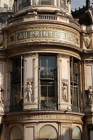
One of the most enthusiastic exponents of the use of colour in architecture was the architect Paul Sédille, who created the colourful façade of Printemps when he restored the building after a fire in 1881.
Sédille worked closely with Jules Loebnitz, whose company made earthenware tiles that did not crack or break when used on façades. Together, the two added colour to many Paris commercial and exposition buildings.
When I looked up Sédille (1807-1900) in an encyclopedia of French architects active in the 19th century, I found that he had designed one of the most colourful houses I have ever seen in Paris at 32, rue Eugène Flachat.
The other side of the house is visible at 51, boulevard Berthier. Same colour, but with a different treatment and different motifs in the mosaics. And yes, the bricks and tiles came from Loebnitz.
I was fascinated by this peacock of a house, and wanted to know more.
At the moment, the house appears to be used as offices. It is listed on the Internet as the address of the headquarters of Monceau Fleurs and the Centre de Formation Professionnelle des Fleuristes Modernes – appropriately enough – as well as the office of an architectural company called Build Up.
The encyclopedia of architects notes that it was built in 1892 for “F.-G. Dumas.” This turned out to François-Guillaume Dumas, editor of Paris Illustré and the Revue Illustrée, publisher of art catalogues, and author of an 1889 guidebook called Paris, ses vues, places, monuments, théâtres, etc.
Clearly this art publisher was making a strong statement in favour of colour in architecture. Some might find the colour a bit overpowering, but right now, in the middle of February when Paris is suffering through a rare snowy spell, the jolt of turquoise could be quite therapeutic for passers-by.
Text by Philippa Campsie; photographs by Philippa Campsie and Norman Ball, except for the photograph of Printemps, which comes from Wikimedia Commons.
* Et si Paris n’était pas cette ville monochrome que l’on nous décrit souvent ?


Another inspiration for walking off the beaten path in Paris….and to look UP and see the
buildings….thank you so much. I love your articles !!!!
Philippa:
Tremendous article about colour in Paris. Love 51 rue Berthier!
Many thanks!
Love to read your thoughtful words about Paris. I, too, see Paris as a city filled with color, and not just the grey so often associated with it.
Merci!
Paris hues are always so beautiful and plentiful. The city really is all about color!
Pingback: Le Bazar de l’Hotel de Ville | Parisian Fields
Pingback: Geraniums by any other name | Parisian Fields