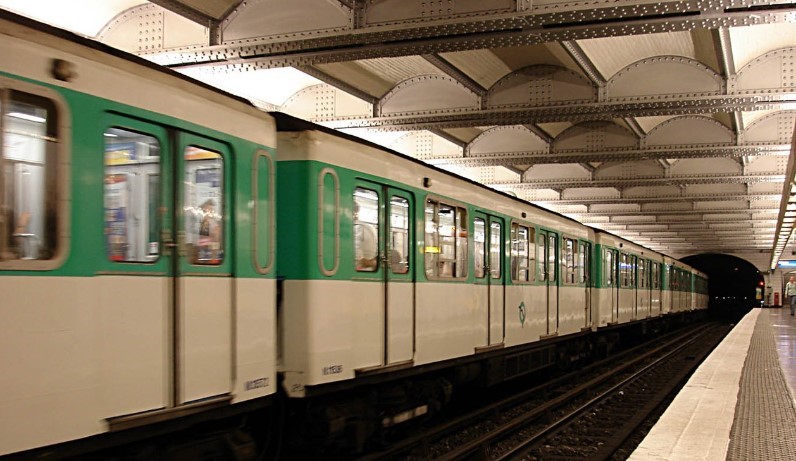
On our visit to Paris in December 2023, our closest Métro station was Bastille. It is one of my favourites, with a view from the Line 1 platform over the péniches and pleasure boats in the Bassin de l’Arsenal.

We used the Métro more than usual on this visit, because the station entrance was so close, and because Line 1 is so useful for getting across the city. On previous visits, we stayed at an apartment much farther from a Métro station, where buses were more convenient, and we enjoyed seeing more of the city from the bus. But this was winter, it was cold, the Métro was nearby, so we took the Métro.
We also visited an exposition at the Cité de l’Architecture on the history and future of the Métro (it remains open until June 2024). The entry to the exhibit featured floor-to-ceiling screens on which were projected films of the massive construction projects involved in the building of the Métro. Norman was entranced.
We were impressed to learn that the first stretch of the Métro (now Line 1), which opened in 1900, took 20 months to build, using manual labour rather than heavy equipment. (By comparison, Toronto has been struggling to build a light-rail crosstown line for more than a decade, and the opening date has been constantly postponed and now appears to be a classified government secret.)
We rested while sitting on a section of an old second-class carriage, with its wooden seats, a place for luggage, the CMP (Chemin de Fer Métropolitan de Paris) logo, and a view of a station platform beyond the window.

The last part of the exhibit dealt with proposed expansions to the system. There were architectural models and mock-ups of new stations, many quite attractive, but some of the descriptions made me laugh out loud. Here is one example (all the displays had French and English captions):
Beyond the individual conceptual design of each project, the charter encourages the development of ‘serene’ and ‘frugal’ atmospheres, capable of arousing the sense of passengers through effects of ‘insistence’ and ‘intensity.’ It is through the senses that the station must elicit a sense of place…
Right. I’m sure if the passengers ever look up from their smartphones, they will appreciate the serene insistence or the frugal intensity of their surroundings.
But those are not the words I want to talk about. After returning home, I read a book called Metropolitain: An Ode to the Paris Metro by Andrew Martin* that contained wonderfully specific words for details of the Métro, many of which I had never seen or heard before. The book has no images whatsoever, but it has a wonderful vocabulary.
Here is a word I did not know: loqueteau. It is the name for those metal door openers that passengers have to operate themselves, pulling up sharply on the handle, “whereupon the double doors spring violently apart as if they’d always hated each other” (page 23; Martin is rather good with metaphors). You find them on the older turquoise-and-white cars.
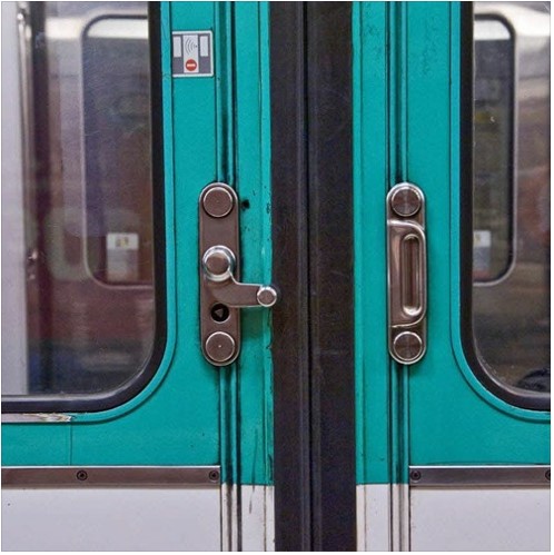
Martin seems a little intimidated by these things and prefers to let someone else open them. I love them and feel privileged to be the person nearest the door whose job it is to lift the latch and free the passengers behind me.
I did know the word for the flip-up seats near the door: strapontins, because they are mentioned in a sign inside each car cautioning that they should not be used when the car is crowded.
Another term I had not known is PILI, an acronym for plans indicateurs lumineux d’intinéraires. I remember these maps from my time as a student, although they are rare these days. They appeared in the late 1930s and started to disappear in the early years of the 2000s.
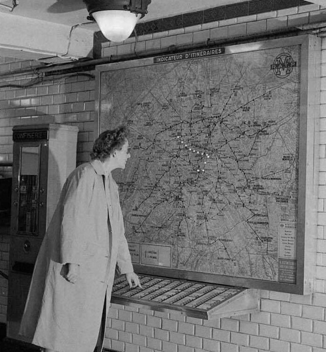
Martin waxes poetic about these lost devices:
You pressed the button for your destination station, and a route was suggested for you by a line of little lights. … The sudden appearance of a glittering necklace is very gratifying and you immediately press another station name at random for no reason except to see another necklace.
A man after my own heart. He says there is still one at Miromesnil, and on our next visit, I shall have to take a look myself.
Another lovely word is édicule, often applied to the covered Métro entrances designed by Hector Guimard. My Petit Robert defines édicule as a little free-standing religious building or a small construction on the public way (such as a Vespasienne). Guimard’s station entrances are so much more than just a railing surrounding a flight of steps leading down, and they deserve a special name. Some are also known as libellules (dragonflies) for obvious reasons. This one is at Porte Dauphine at the end of Line 2, in the 16th arrondissement.
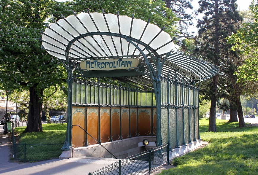
Guimard even designed an entrance to the Bastille station, in a style known as pagode (pagoda). It was, alas, demolished in the 1960s.

Martin also provides words for elements of the stations, such as tablier métallique, for a special kind of ceiling. Instead of the usual wide arch covered with tiles, the tablier métallique has girders running across the tracks with small arches between them. Martin explains that they are found in stations where the ceiling is close to the surface. There is a bit of tablier métallique at the aboveground part of the Bastille station on Line 1, but the example shown below comes from Bréguet-Sabin, Line 5.
Now I will know to look up and exclaim, “Regardez le tablier métallique!” when I disembark at certain stations. Well, maybe not, but I could.
The book includes a detailed history of changing fashions in station design, with a name for each version.
The default is the original white-tiled vault. You can see a hundred of these at a website called Cent Stations du Métro Parisien, which offers 100 mostly black-and-white photographs by Daniel Buren, taken in the 1970s, displayed alphabetically by station. They are all taken from the same angle and the repetition of advertisements and wooden benches in nearly all the photographs creates a sense of monotony.
There were, however, subtle difference between the CMP stations and those of Nord-Sud, the company that built Lines 12 and 13. Here is Pasteur Station, Line 12, photographed in 1974.
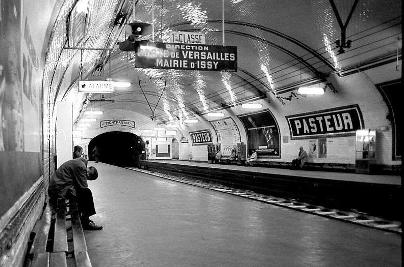
Note the vertical side walls (best seen on the left side of the photograph), as well as the lines and swags in the tiles on the curved ceiling. By contrast, the white vaults of the CMP had walls that curved down towards the platform and the ceiling tiles were plain white.
Things started to change in the 1960s when the tiles were covered with large metal panels, a style known as carrossage, in certain stations. Carrossage certainly allowed more space for advertising, as shown here at Falguière on Line 12.
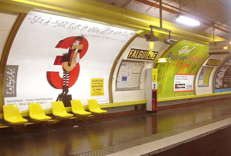
It makes me think of the way in which nice old brick or stone buildings in small Ontario towns were covered with aluminum siding in the 1960s in an attempt to make them look modern. The siding did not age gracefully, and neither, it seems, did the carrossage. The style survives at a few stations, particularly my least favourite, the gloomy Franklin D. Roosevelt Line 1 platform. Its ghastly hanging light fixtures look like something from an outdated disco, and they obscure signs above the platform for exits or connections.

On the other hand, our favourite station is also an example of carrossage, but created with flair and imagination: the Arts et Métiers station, Line 11.
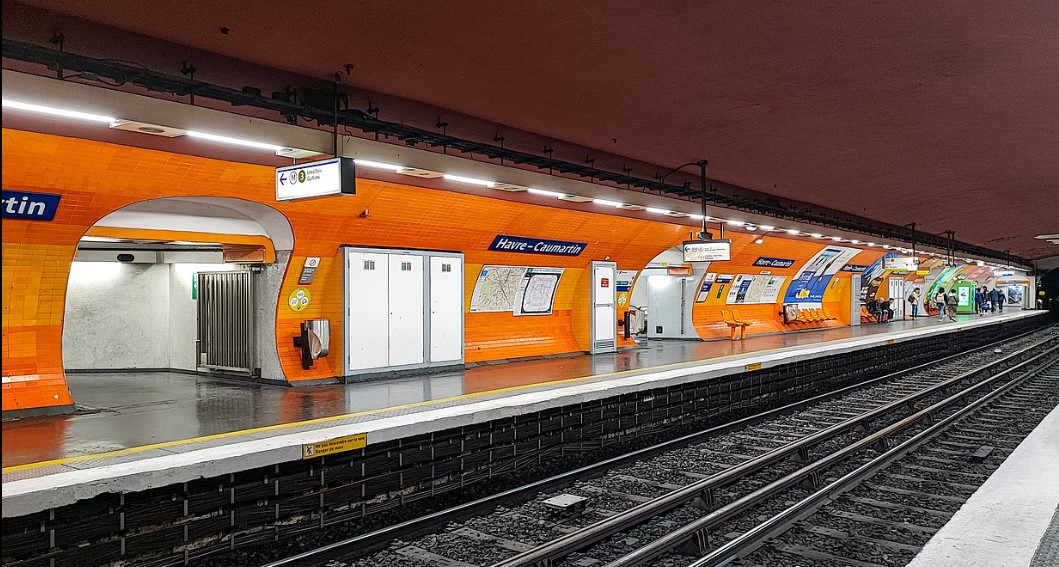
The next innovation in station design is known as Mouton-Duvernet, because it was first used at the station of that name in 1968. It was orange. Really really orange. That was the colour of trendy modernity at the time. Here’s how it looked at Havre-Caumartin, Line 9.
Moving right along, and one does want to, the next version was called Andreu-Motte, because the designers were Paul Andreu and Joseph-André Motte. This style, implemented in the late 1970s and early 1980s, affected the lighting, which was suspended from the ceiling in a long, coloured box. This colour was repeated in a low tiled shelf on which individual seats are fixed.
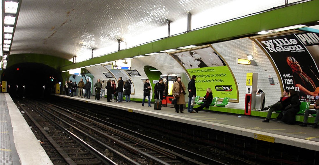
The wooden benches photographed by Buren had fallen out of favour as people took to sleeping on them, and were replaced by individual seats attached to the wall. Now a version of the long bench was reintroduced. I have seen people sleeping on the shelf, so its seems we have come full circle. Here is the style in green at Montparnasse-Bienvenüe, Line 13.
The next style was called, interestingly, Ouï-Dire (which means hearsay), and dates from the 1980s. Coloured lights were projected upwards to create interesting effects, unique to each station. This one is at Crimée, Line 7.

The updating and refashioning continues, under the unmemorable name Renouveau du Métro. Some older seats are being replaced by enamelled metal ones with a circular outline. I photographed the colourful ones shown below, not in the Métro, but in La Samaritaine, where I recognized the shape immediately. The name for this type of seating is coque (shell). Note the bevelled tiles in the background, another hallmark of the Métro.

Finally, although Martin does not mention him, I can’t resist a shout-out to the Lapin du Métro, the hapless bunny forever getting his paws pinched in the moving doors. He, too, has a name: Serge. I have mentioned him before, with a picture of the version in yellow pyjamas, but he has been updated to keep with the times and now wears jeans, T-shirt, and sneakers.

Not only does he warn against putting one’s hands on the doors, but in other illustrations he is shown getting squashed by closing doors while entering after the timbre sonore has sounded, and getting his feet pinched on the escalator. Poor Serge. He was created in 1977, with very short ears, wearing a red overall. The design was updated by Serge Maury in 1986 (yellow pyjamas and much longer ears) and once more in 2014 (jeans and T-shirt).
Everything has a name in the Metro and everything is subject to fashion.

Text and original photographs of museum display and coques by Philippa Campsie; close-up of ceramic tile by Norman Ball; photograph of loqueteau: https://soundcloud.com/ratp_officiel/sonal-de-vigilance; all other images from Wikimedia Commons.
*London: Little Brown/Corsair, 2023.


Wonderful article on the Metro! My first international travel was to Paris as a kid in the 70’s. I was fascinated with the elegance of the Metro with its smell of Gitane cigarettes and the sounds of the musicians who played along its walkways.
Last December, there was a wonderful trumpeter in the Bastille station. One day I stopped to give him some money and thank him for not playing cheesy Christmas songs. Every time after that, he remembered and greeted me, then he would launch into something wonderfully non-Christmassy. I hope he is still there on our next visit.
Lovely! There’s something beautiful and haunting hearing music echo through the Metro walkways.
Very much enjoyed this blog on the métros of Paris. I can hear the sounds of the doors latching, the distinct smell of the underground stations, and the many reasons to avoid changing métros at Châtelet-les Halles whenever possible. Your blogs so capture the essence and history of Paris in such a delightful and instructive manner. Thank you for the time you take to write these blogs.
If you scroll down to the end of the blog to the picture credits, the photograph of the loqueteau came from a website called Soundscapes. Click on the link, and you will hear the sounds of the Metro. It will take you right back. And I share your aversion to Châtelet-les Halles. I will go miles out of my way to avoid changing trains there!
Station name graphics are also evolving. The older style of using blue tiles on a white background with upper and lower case letters is changing. The new look uses metal signage and no upper case lettering.
The move from all caps to upper- and lowercase signs seems to be universal. For years, Toronto street signs were all caps, black on white in a distinctive shape. Now we have new blue and grey signs with upper- and lowercase street names.
I really enjoyed this. Only recently I discovered your blog. I look forward to more posts and looking through your archives.
Thank you so much for your kind comment. I am glad you enjoyed the most recent post, and I hope you will find others you enjoy as well.
Hi Philippa Thank you for sending this to me. I never would have thought a subway system’s stations could be so interesting, but, you have certainly made them so. One of the strangest things I ever saw in a station in Paris was a pair of perfectly good men’s shoes (no one in them)set beside the tracks. I don’t know whether there were cemented in to the platform but it looked weird. I’m delighted that you and Barb will be collaborating on her French bottle opener. All the very best Olive
You just never know what you are going to see in the Metro!
I just discovered your blog today. Thank you for evoking memories of Paris–and the Metro.
During my first visit in 1980 (which resulted in my living there for three years), some old wooden Metro cars were still in service mainly, as I recall, on lines 2 and 12. Trains were divided into first- and second- class sections and at least one seat in every car was reserved for les mutiles de guerre. of whom there were still many. The gendarmes actually enforced that distinction: I saw an officer lead someone obviously too young to be a veteran, let alone a mutile, off the train. (The mutiles had special ID cards in case their infirmity wasn’t visible and to show that it was indeed incurred in the line of duty.)
The Bastille station of the #1 line is one of my favorite mass-transit stations in the world, for the reasons you mention.
Oh, I loved those signs with Serge. And, yes, I quickly learned to avoid the Chatelet-Les Halles station. On the other hand, the first moving platform (which looked like a flattened escalator) I ever used, anywhere, was in the Montparnasse-Bienvenue station.
Thank you for your message. I was also there in 1980. I can also remember the buses with the open platform at the back, which survived into the 1990s. That was a wonderful way to see the city!
Ah, yes, the open-back buses. From them, you could enjoy the city en plain side. They were like moving sidewalk cafe tables.
And I was in awe of the PILIs: They, and much else about the Metro, made the NYC subways seem like something out of “the Flintstones” as Hieronymous Bosch might have envisioned them.