
When you arrive at Charles de Gaulle Airport in Paris, one of the first things you will see is the work of a man who died on September 10 of this year: Adrian Frutiger, type designer.

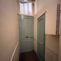
You won’t give it a minute’s thought. You will look for your gate and the shops and move on. But the ease of finding your plane and your duty-free Veuve Clicquot depends on clear signs. Now, of course, more and more airports are signed in pictograms. But not everything can turned into a picture (such as, apparently, an airport lounge, judging by the image above). And for those signs, there’s Frutiger. The designer’s name is now forever attached to the typeface used at Charles de Gaulle.
Frutiger’s obituary in the New York Times on September 20 quotes Erik Spiekermann, a German type designer, who notes that the Frutiger typeface “doesn’t call attention to itself…it makes itself invisible, but physically it’s actually incredibly legible.”
The best typefaces are invisible. One is so busy absorbing the content of the message that the actual form of the message disappears. As Frutiger himself put it, “If you remember the shape of your spoon at lunch, it has to be the wrong shape. The spoon and the letter are tools; one to take food from the bowl, the other to take information off the page… When it is a good design, the reader has to feel comfortable because the letter is both banal and beautiful.”
Frutiger seems to have developed this approach over time. After training in Switzerland, where he was born, he settled in Paris and went to work for the type foundry Deberny and Peignot.

(Now here is where I get to admit that I am a type snob, and the minute I saw the name “Peignot,” I thought, what, the creators of that font? The font named Peignot, which is not the one shown above, was designed in 1937 and enjoyed a resurgence in the 1970s. It may look familiar to people of a certain age as the font used for the “Mary Tyler Moore Show.” I don’t think it has aged well. But I digress.)
Frutiger’s first efforts with Deberny and Peignot were varied: President, Ondine, Meridian. These are not invisible or banal typefaces, but he was a young man making a name for himself at this point. Here is a sample of each, in order:

Things changed in 1954 when he developed the simple, clean, sans serif font Univers. This was three years before the creation of the now-ubiquitous Helvetica. Frutiger indicated the difference between the two quite simply: “Helvetica is the jeans, and Univers the dinner jacket.” If you compare the two, you will see the subtle elegance of Univers in comparison to the workaday appearance of Helvetica:

(The top one is Univers.)
But there was more to it than that. Univers was a system, a whole family of fonts that could be specified by number, rather than the vaguer, more subjective terms “bold” or “extra bold” or “italic” or “condensed.” It was neat, precise, and well-organized and allowed for greater choice.

Here’s one of many examples of Univers in use: London street signs.

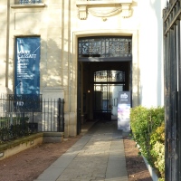
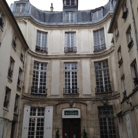
Adrian Frutiger was in his twenties when he created Univers. In 1962, at the age of 34, he opened a type design studio at the Villa Moderne in Arcueil, just outside Paris, with two colleagues, André Gürtler and Bruno Pfäffli. I am not sure if the building survives, but an image of it appears on the cover of a book.
 A few years later, Frutiger became involved in the planning for a new Paris airport at Roissy, to the north of the city. I love his description of the early discussions:
Paul Andreu, a dynamic young architect and engineer, was entrusted with this project. He formed an architectural study group comprising interior architects, color specialists, philosophers, a musician and a typographer. Long evening sessions for brainstorming were accompanied by food and drink.
The discussions were something quite new for me. Each member of the group just said the first thing that came into his head on successive subjects. I remember one of them recommending that the experience of take-off be made to last as long as possible, so that passengers could truly and deeply experience their separation from Mother Earth. After half a dozen glasses of wine we heard proposals like the desirability of laying down a pasture for sheep at the airport.
Can’t you just see it? Philosophers and a musician! I am willing to bet that most of them were wearing black turtlenecks and smoking Gauloises as well as knocking back the red wine. Frutiger continues:
I was commissioned to design the entire signage system for the airport. Everyone thought that I would want to use the Univers typeface, but I was aware that this kind of sanserif face had too round and closed an effect for the easy recognition of word-signs. I took out the drawings of Concorde, the sanserif which I had designed…in collaboration with André Gürtler, and made some sketches. The banana-yellow background recommended by the color specialist was obtained by superimposing several transparent Letraset color foils, and we cut the word “Départ” from a rather bolder and more expanded version of Concorde, with the word “Departures” pasted above it in black. Proof of better legibility than Univers was not hard to demonstrate. In addition, Paul Andreu was fascinated by the thought of using a special kind of “Airport Type.”
Thus was born the typeface now known as Frutiger, although it was first called “Roissy” and only later named for its creator. One distinctive touch was the stubby little arrows used to indicate direction.

(As for the musician who participated in those late-night debates, he might have been Bernard Parmegiani, who created the sound known as “Indicatif Roissy” that used to play just before an announcement over the PA system. Click here to hear it.)
Frutiger later reconsidered his work at the airport, still referring to the typeface as “Roissy”:
What I may say as a critic, after thirty years of the use of Roissy Airport typography, is this: that the Roissy face is too light and too closely set. Moreover there is too little space, too narrow, around the letters, especially in the signage for the access roads. The first thing the driver sees on arriving is the colored rectangle.
He was always very conscious of the space around type, of the voids and shapes created by the background behind the type. Indeed, he once said, “When I put my pen to a blank sheet, black isn’t added but rather the white sheet is deprived of light… Thus I also grasped that the empty spaces are the most important aspect of a typeface.”
Meanwhile, his typeface had left the airport and entered the Metro. Yes, those wayfinding signs are Frutiger.

(Newer Metro signage uses upper and lower-case letters and is in a typeface known as Parisine, created by Jean-François Porchez. But the older signs in all caps tend to be Frutiger.)
You’ve also seen it on Rand McNally maps published since 2004 (before that, it was Univers).

And here in Canada, our national radio and television broadcaster, the Canadian Broadcasting Corporation, uses a version of Frutiger Bold.
![]()
Everywhere, and yet invisible. Frutiger went on to create more fonts that were less self-effacing, such as Herculaneum, Iridium, Serifa, and Versailles, shown in order below.

But he will probably always be best known for the unremarked but nonetheless extraordinary fonts that get us where we want to go.
Adrian Frutiger, 1928–2015

Text by Philippa Campsie; font samples created at linotype.com, which is also the source of the quotations from Adrian Frutiger; photograph of Adrian Frutiger by Henk Gianotten, other images from Wikipedia.
If you are interested and would like to learn more, I recommend the slides and commentary by Mark Simonson, available on SlideShare.


What a beautiful and insightful tribute to both the man and the font, Philippa! Thanks to you I will have an entirely different appreciation for the signs the next time I arrive at CDG — not to mention get lost in the Métro tunnels. Merci infiniment.
Frutiger’s big insight was that what works on the page may not work when you are rushing through an unfamiliar space dragging a suitcase. Not everyone has arrived at this level of wisdom!
Philippa
A terrific article on some “type” history that is truly fascinating. There are many typefaces misused now that they are readily available on everyone’s computers that make so many ads and signs unreadable. On top of that there seems to be a deliberate attempt to make all words usually deemed important relegated to the “fine print” and no longer available to my aging eyes. Its wonderful to read of a type designer with this kind of sensitivity and ability. One could find endless photographic material to support a blog on unreadable signage. Thanks for writing about Adrian Frutiger.
I couldn’t agree more. Just because the typefaces are available doesn’t make them right for all purposes. And don’t get me started on what passes for type design on PowerPoint!
Philippa
Dear Philippa..
There’s more good stuff about type in your little post than I found in classes at three design schools! And it’s never too late! Many thanks.
In some ways, I feel about writing the same way. Although on occasion it is nice to appreciate a fine turn of phrase for its own sake, most of the time, the writing should simply vanish behind the subject, so you learn about it without feeling that you are having to work your way through a thicket of language.
Philippa
Fascinating article Philippa! I was recently in a Toulouse shop that is all about pastel and its history. The manageress wrote down some details I asked for in exquisite handwriting, something you still can find quite widely in France. When I remarked on this she referred me to the local Scriptorium museum (which kept penmanship alive for decades) and then proudly showed me a pastel reprint produced by the shop, of one of those penmanship copy books used in schools in the 50s packaged with replica dip pen, nibs and blotting paper! Perhaps these longstanding handwriting traditions had some influence on the type designers of the Frutiger era, all of course pre-dating computers/mobile devices and their devastation of handwriting skills?
I have always loved French handwriting. I must visit that museum some day.
Frutiger is amazing, because he began in the days of hot metal type, and made the transition to computers. Among his achievements are the first fonts designed for Optical Character Recognition (OCR fonts). He adapted to technology because his primary interest was legibility. The rest was just detail.
Philippa
A new post from Parisian Fields is always an adventure! Thanks so much for this lively visit to the world of design!
Thank you for your comment. The feedback is always heartening.
Philippa
Very interesting article. Who knew all that goes into helping us get to where we want to go.
I once worked with graphic designers, and it is amazing how much work and thought goes into signs that barely register on our consciousness. You only notice signs when they are terrible. When they are just right, they are invisible. (Rather like cleaning house…nobody notices a clean house, only a dirty one!)
Philippa
Fascinating, as always.
Wonderful. Clean design is so important in organizing our worlds.
A shock to learn that Adrian had left us. As a graphic designer, I worked many times with him on typefaces and logotypes. He was always fascinating to talk to and work with. Unfortunately we didn’t manage to use an adaptation of Univers for the french highway signs, but it was not without trying. 3M the manufacturer of scotchcal used to make the highway signs imposed their monstrous typeface that is still in use today. Philippa, it was a pleasure to read your thoughts and remarks.
Best regards, perhaps we could meet one day it would be a pleasure for me.
Marc
NB… I use Univers as my standard font on my Mac.
Sorry for my bad english!
The photo of Villa Moderne you published is the “artists house”, property of Norvegian Embassy quite near to Atelier Frutiger & Pfäffli. I shared the studio with Adrian for over 30 years.
Thank you very much for your comment! How wonderful to hear from another type designer. What a privilege it must have been to work alongside Adrian Frutiger.
Pingback: Typographer Bio Card – TerriZebrakDesigns
Pingback: Graphic Designing – Site Title