One evening in 2007, we left our rented apartment on rue Charlemagne for a walk in the Marais. On the rue de la Cerisiaie, we peered at a small poster on the glass door of a narrow workshop. Suddenly, the door opened and a man beckoned us in.
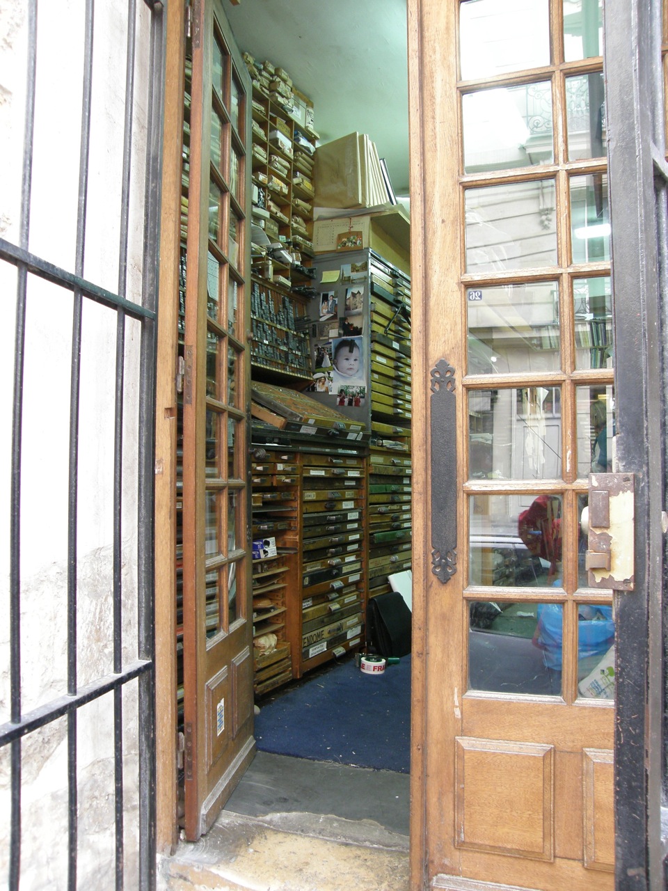
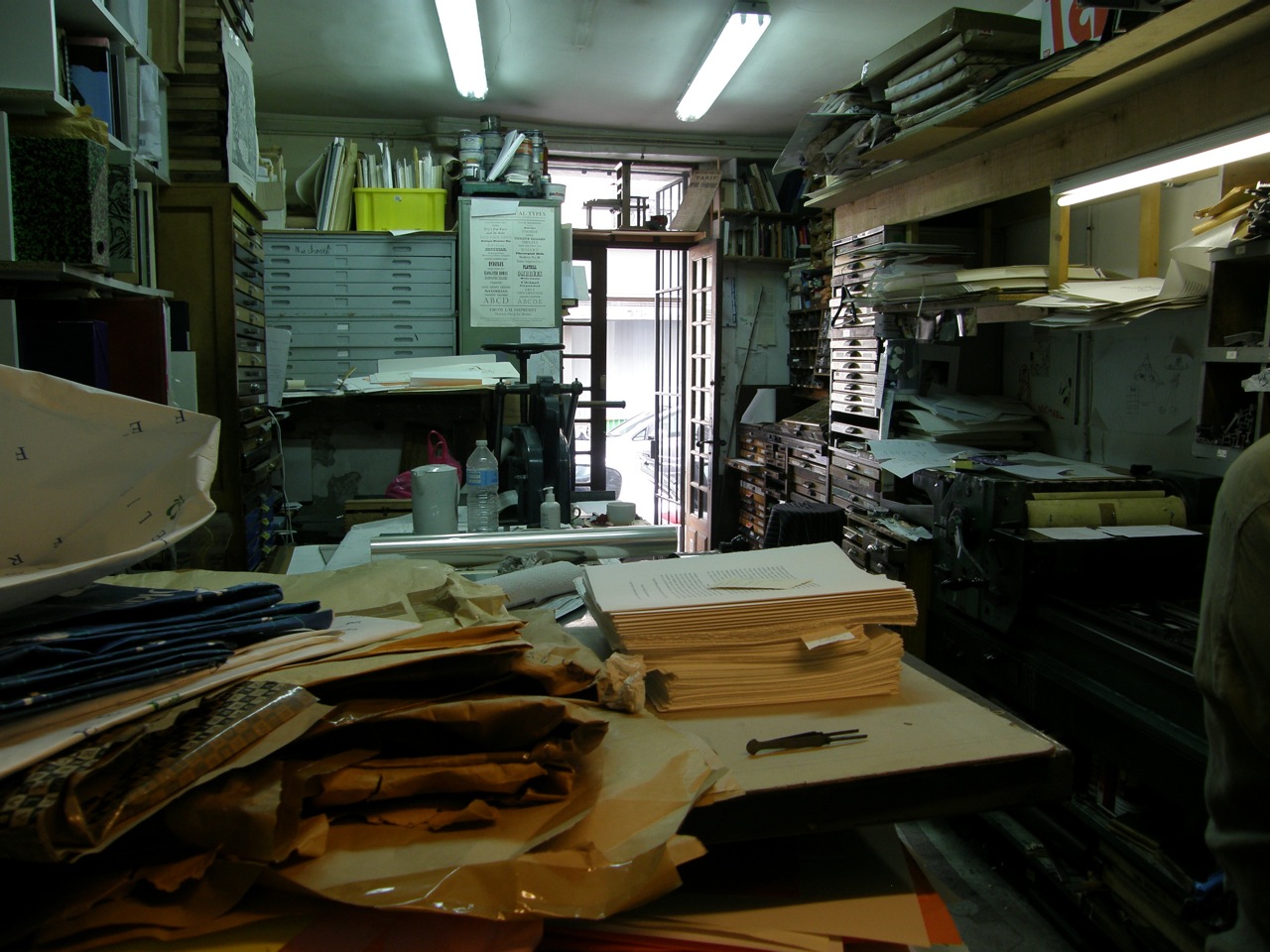
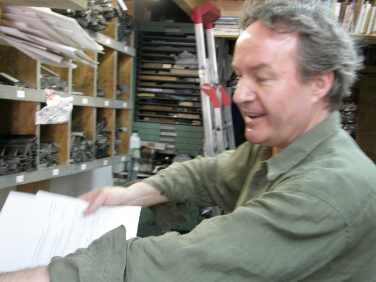
It was a printshop, one with a letterpress printing machine and countless drawers and boxes of lead and wooden type. We were enchanted. The printer’s name was Michael Caine (no relation to the actor of the same name).
Our impromptu visit turned into an hour of conversation about printing and type, and an invitation to attend a closing of a show of his work two days hence at the Librairie des Argonautes. (A closing? Usually one is invited to openings. Philippa said, “Norman, it’s Paris. Any excuse for a party and a drink.”)
The event was delightful. The space was so small that everyone took turns being inside looking at the prints or outside chatting on the sidewalk. We could not afford to buy anything then, but it was the beginning of a friendship.
Since that day, no trip to Paris is complete without a visit to the print studio on the rue de la Cerisiaie. At 38 square metres, the studio is small, but the output is astounding. Each time we get together, I am in awe of Michael’s knowledge, artistry, patience and dedication. He is modest about his gifts and told me, “My family, I recently learnt, is composed of painters and decorators on both sides, going back three generations. One grandad was a master woodturner of repro furniture, so it’s following the family line. Good with one’s hands.” But there is more to it than that.
When Philippa and I visited this June, Caine had just finished his second work by James Joyce for Ithys Press in Dublin (his first was The Cats of Copenhagen). We spent a long time poring over pages as Michael explained what he had done and why. The title page alone of Finn’s Hotel was an education in itself.

Michael pointed out that in the four rows of five letters each he used four different fonts: two William Morris initials, some Jenson, boldface Giraldon, and Lombardie. He spent a long time on the letter spacing. The positioning of the bold seems to create a code of its own. Michael knew that readers might puzzle over it as they puzzle over everything that Joyce wrote. Are those letters spelling out an obscure message?
In fact, he was simply looking to balance the darker letters, to create what he called “syncopated randomness.” And, like Joyce himself, he was playing with languages; the language of fonts, which suggest different cultures—in this case, Irish and Scandinavian.
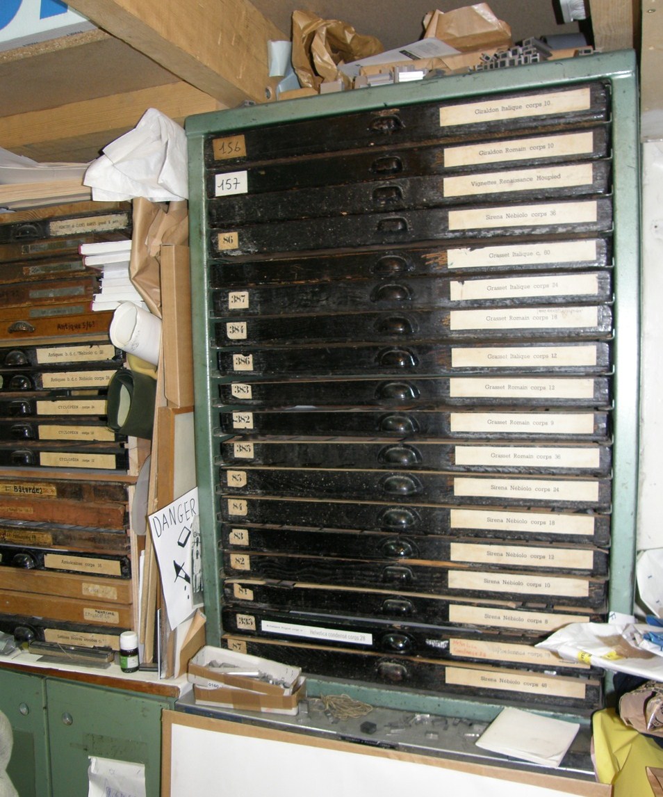
There is a story behind each font, mostly involving rescuing—or buying—types from other print shops that have closed. And if he needs more of a particular letter of a particular font, there is a man in Frankfurt who has a small type foundry in a shed at the back of his garden and will cast letters to order. To Michael it is a wonder of the age that the matrices for many old types have been saved and metal type can be purchased with an e-mail.

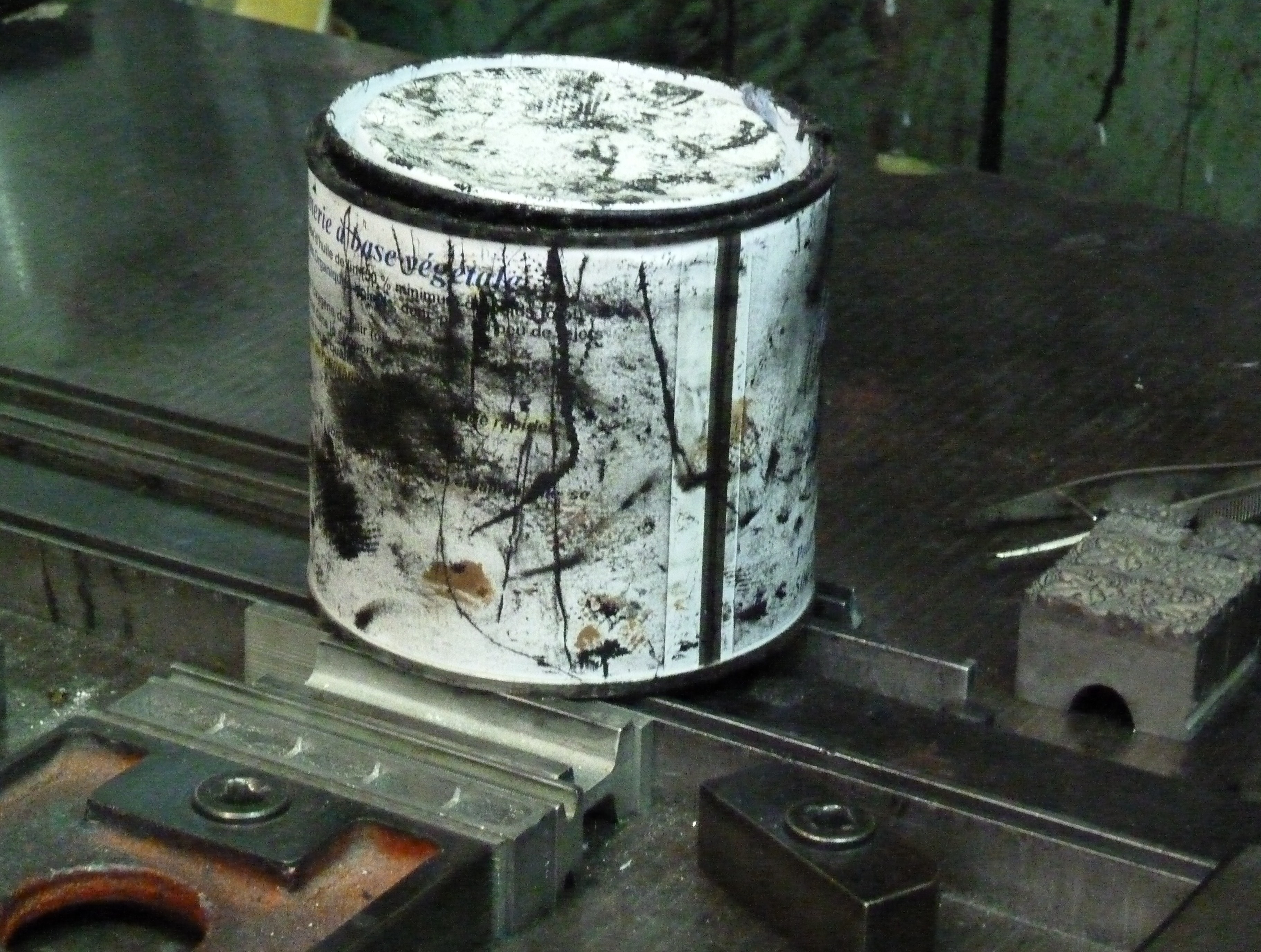
And the black ink that is so rich, deep and velvety? That comes from Monsieur Momal, a retired gendarme in the south of France who learned how to make printing inks from lamp black pigment and linseed oil with the right viscosity for the presses Michael uses. Modern commercial ink makers save money by scrimping on the pigment, no matter what the colour, but the richness of Michael Caine’s printing comes in part from the pigment. Letterpress printers treasure a good ink maker.
Letterpress printers must also know paper intimately and how to use the right combination of paper, type, ink, and press, drawing on all of the mysterious little tricks one picks up along the way. Michael recalls that as a student he once did a bad job of printing because he had picked the wrong paper and did not know that it had to be moistened. He has come a long way since then. How far? His books are one answer. So too is the fact that in 1999 the French Ministry of Culture nominated him as the Elève successeur to the Maitre d’Art en Typographie. This is part of a program to perpetuate the arts and crafts that are dying out. In Japan the equivalent honour is to be recognized as a “national living treasure.”
There are fewer and fewer printers like Michael in France, or indeed anywhere in the world. He explained that in the 1920s, France had 180 book societies ordering hand-printed books. Now there are three. Books are the love of Michael’s typographic and printing life, but his business also depends on more mundane orders, such as correspondence cards, posters, menus, business cards, and invitations to weddings and other important occasions.
How did he develop his skills? In 1979, as a first-year graphic arts student at the London College of Printing, he fell in love with “the medium of the hand-printed book” and, as he would later write, “there was no turning back. I was seized by the possibilities of what I could do.”
As a student he quickly learned, but ignored, the fact that one was supposed to be either a graphic designer or a printer, but not both. He was warned by his professors that there would be “repercussions” if as a designer (one of the chosen) he spent too much time with the printers (slaves). At the time, he did not realize the immense challenges he would face in being a maker of books.
Happily, he came to France. As a second-year student who didn’t seem intent on following standard paths, he was sent by the London College of Printing on an exchange with the Ecole de Beaux Arts in Nancy in eastern France. Later he would write that “in three happy months in the Art Nouveau heaven that was Nancy, I succeeded in cutting an entire book out of wood; text as well as image, a setting of the absurd surrealist poem The Blue Dream by Louis Aragon.” Caine’s edition of The Blue Dream was selected for inclusion in the 1984 exhibit of British Artists’ Books since 1970.
By the time he graduated in 1982, Caine had not “done the right things” expected of a graphic arts student, but he had worked hard with a prodigious output. In 1998 he wrote that “despite the general hostility to producing books, I managed to produce (and bind myself) eight different editions of Apollinaire, Aragon, Auden, Lorca, Mayakovsky, Ritsos; all illustrated with my own etchings, woodcuts, and linocuts; the final tally being some one hundred and twenty-six books. I left the college with a basic knowledge of every aspect of book production, from comping right through to binding.”
He earned a master’s degree, and continued to produce beautiful work that attracted enough attention and sales that in September 1990 he emigrated to Paris after “having spent most of my adult life dreaming of living in Paris.” There he began the combined life of part-time teacher (at the Ecole Superieure Estienne des Arts et Industries Graphiques) and letterpress printer. He entered the Atelier de la Cerisiaie that year as assistant to French artist-publisher Jean-Luc Lerbourgh. In 1992 when Lerbourgh left for Brittany, Michael took over the studio. He is still there.
I recently asked Michael what he was trying to achieve. “To print texts of great value, worth reading in 200 years’ time and at prices people can afford.” He works “to create something alive and contemporary in an old, dead technology.” And yet it is far from dead. Certain connoisseurs see and appreciate what he is doing. It is not just the rare “illustrators who appreciate detail, hard work and long hours spent on the ‘ridiculously futile.’ ”
I am fortunate enough to own some of his work, including a bilingual edition of Livres by Paul Valéry. Here are two of its pages.

There are times when I pick up something he has created to feel it in my hands, to run my eyes over the text, and find details and subtlety that had eluded me earlier. I am greatly privileged.
Text by Norman Ball; photographs by Norman Ball and Philippa Campsie


I just got home (to Vancouver) from Paris yesterday and am using my jet lag early morning hours to catch up on blogs. This post is a wonderful reminder of how inexhaustible are the discoveries paris offers to those who peer curiously in its windows. Thank you so much to folding in so much information about the art of book-making into the charming history of your friendship.
I just found your blog and read your post with great interest – a terrific post, and I learned a lot. I am a bookworm since I was a wee child and by now must have over 5,000 books or more – unfortunately – I say that because they are everywhere in the house and I need to let go of many. There is nothing like the feel of a book and reading a book with beautiful font, and illustrations too. Sadly, so many bookstores are going out of business (here in the US) because people are reading ebooks or not reading much. I believe though that with the upcoming environmental problems books will make a comeback (maybe not in my lifetime though.) Now I have to read your past posts as I thoroughly enjoyed this one.
I love this blog. I found it via Google after searching for articles/info on Michael Caine. He taught me typography at the London College of Printing in 1986. I have never forgotten the dedication and enthusiasm he brought to his craft. Glad to see in this bog that he is thriving!